The handsome solid red brick Californian In Coburg in Melbourne’s North was inward looking with a shabby asbestos-clad lean-to extension closing it off from the garden. The clients, Sarah and Ben love living and eating outside so wanted to improve the connection to the garden and carve out a space for sheltered outdoor dining. They imagined a laundry for muddy gumboots and glass jars full of cuttings, a kitchen that can work hard, looking equally good when in chaos or clean and tidy.
The clients wanted a home bathed in sunlight; a space that felt generous, retaining the lofty spaciousness of the existing period home. A home for a family to grow with spaces that allow for separation and connection. A home that allows the family to be within reach, sight lines to children whilst allowing autonomy. Rooms for the family to retreat to and a guest room for out-of-town relatives to stay.
The interiors are the antithesis of a soulless display home. We worked to make them warm and lived in and welcome existing treasures passed on through the generations. Sarah and Ben’s house existing home was joyously curated with a mishmash of old and handmade, each item much loved and with a story attached and we wove this idea into the new spaces.
The challenge was to cohesively blend the charm of the existing heritage home with the contemporary extension. The rear layout of the house was flipped so that the kitchen/living/dining all interfaced the garden. Balancing the client’s desire for connection and privacy. This project was a dream collaboration where the Architect, Interior Designer, Client and builder all worked together to carve out a form and, together slowly honed each detail to create a whole.
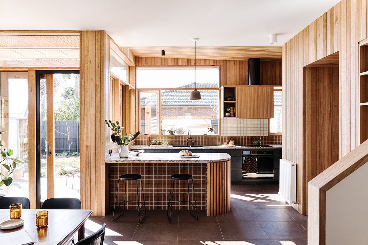
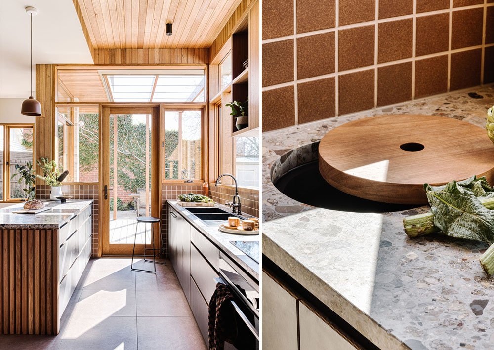
In the kitchen the beautiful benchtops, like a river bed of polished stones, informs the palette of the kitchen. Warm, earthy colours with subtle textures effortlessly hide the fingerprints and smudges of a well loved kitchen. The gunmetal sink overlooks the garden, a perfect spot to bask in the sunlight whilst tackling the morning dishes. The dark brass tapware is rubbed golden at the handles from daily use.
The open pantry allows the little bit of functional chaos of family life to be tucked around the corner, leaving the spacious bench uncluttered. Appliances are housed in their cosy nook, with open shelves keeping pantry items in easy reach. The compost bin is recessed into the bench, with a pretty little custom timber lid. The handless laminate cabinetry with provides a robust, low maintenance surface; its subtle charcoal wood grain texture providing depth and character. The generous amount of drawers reduce the need for overhead cabinets (that are notoriously hard to reach) instead prioritising full-height windows bathing the counter in sunlight.
The organic browns of the Japanese tiles anchor the island bench to the cinnamon floor, the perfect scuffproof surface for kids perched on stools. The timber lining boards glow golden in this light drenched room, the warm variation in the wood creating highlights that complement the eggshell speckled splashback and ceilings painted in Dulux Grand Piano.
Layering and playing with levels helped us achieve the balance between privacy and connection. Early iterations had the living and dining closed of from each other, but an inspired suggestion by the clients was to open this up to the kitchen. This idea developed into one of our favourite features - the open shelving and record cabinet, a home for Sarah's beautiful objects and Ben's beloved records.
Stepping down to the kitchen level, the hardwood framed doorway is a threshold from old to new. It seamlessly folds down to form the banquette seat. The unifying colours of the beautiful wool plaid echo the cinnamon of the floor and organic mid century tones terrazzo benchtops. Aside from being a cosy little nook to enjoy the morning sun, the built in seat is one of the many space-saving tricks we utilised to maintain a spacious feel to the house whilst keeping the footprint compact.
Dubbed the "love bubble" during lockdown this house was conceived over many zoom meetings during the pandemic and while welcoming a new baby Peggy May. Beside the dining is a study nook, a place for new bub Peggy to play while her parent's cook, a built-in seat with storage for toys. This clever joinery item pacts even more into a small space - keydrop, charging drawer, modem cupboard, corkboard and art display.
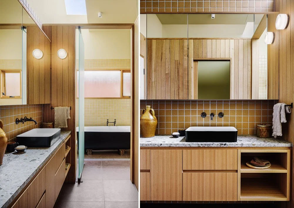
The bathroom, which was relocated to the original kitchen site adjacent the carport, could have been dim and cold. The bathroom is a series of stalls, and could practically be used by three people at once privately. Megan was inspired by campground shared bathrooms, where you have space to dress and a little seat in your “shower cubicle”, so the bath and shower are in their own room with large sandblasted pivot door, and the vanity and WC have their own spaces as well. Light is shared throughout the spaces by open/ glass tops to Timber clad walls and a heavenly slice of light from a long blade skylight that bridges the wet area spaces.
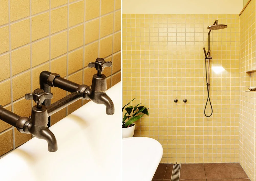
An old family pig’s- trotter foot bath, transported from the country to its new home became a central feature. The white interior and black exterior was inspired black and white ceramic basins which and dark chocolate brown antique brass tapware. The richness of timber lining boards and buttery Japanese tiled walls the space becomes divinley warm and is one of the clients favourite places in the house.
Gentle curves are echoed throughout the project. From the timber-lined island bench there is a layered view through to the hallway door with its semicircle window above. Beyond this, the custom security door can be seen, inspired by an art deco railing spied during a lockdown 5km stroll. In the family bathroom the Japanese tiles hug the curve of the terrazzo-topped seat. Upstairs the architect's lovely undulating curved screen conceals unwanted views whilst revealing beautiful sky and treetops.
The warm palette continues into the laundry. Nestled under the stairs there is a generous amount of linen storage. There is even room for a cosy dog bed fo Pam the beloved family dog who can come and go through her special dog door in the double glazed door. Natural drying is made easy even on the rainless winter’s day with a custom rail above the sink and a hanging drying rack.
This project was a dream collaboration where the Architect, Interior Designer, Client and builder all worked together to carve out a form and, together slowly honed each detail to create a whole.
WORDS BY NICOLA DOVEY- ARCHITECT:
Due to the way the site was set up, and because we wanted to keep the new extension to as small an efficient footprint as possible, we had a particular building envelope we needed to work to, to wedge in the upper level. This second level houses the parents’ bedroom, ensuite, study nook and window seat. There was also the opportunity to set up a small sunny balcony, just deep enough to create a sheltered space underneath and to help cocoon the edge of the bedroom, obscuring views of the neighbours backyard and to create a soft habitable edge for a chair and plants. The envelope we had to work with meant we needed to create a minimum height point a the top of the stairs, to offset this we took the ceiling line of the parents bedroom ceiling up over a lofty 3m. The views from the upper level are dramatic, spreading around from a sea of northern roof tops & chimneys out to the ranges over to the east. Generously sized windows set up in each of the upper level rooms really highlight Melbourne's geography. The sizeable window in the new ensuite gives an immediate view of the character laden moss covered original terracotta tiles and roof spinals. The clients were interested to know how the new might sit alongside the existing in a comfortable way. The existing was a red brick Victorian with a relaxed bungalow entrance and an Arts and Crafts timbered & stucco facade. These existing timbers had been painted in pale eucalyptus. We layered the old and new materially but setting up the new addition with a brick base. Brick is a robust building material, not needing maintenance and providing beneficial thermal mass. Here we sort a contrast between the existing deep red brick and a crisp clear white brick. The upper level was matched in robustness by metal standing seam cladding. The colour palette here extends the pale eucalypt colour in Colourbond Cove. Warm and character laden timbers in Blackbutt were used for the pergola and decking boards. In the spirit of interest and contrast, we incorporated a few playful curves, into the balcony screening, in the external timber bench seat running along the dining table window, that conveniently opens up to store toys and tools, and in the timber step leading down from the sunny living room. That so much amenity has been shoe horned into such a small (new build) footprint is quite extraordinary! The benefits of small footprint design is two fold, it saves on resources which saves clients in the build price but also allows the backyard to stay large, generous and abundant.
Sustainable features of the house:
Drying racks in the laundry and fold down washing line reduce the need for power hungry dryer.
2x4000L slimeline water tanks pump back to laundry and toilet flushing
Compost bin built in to kitchen bench top
Repurposed existing sliding doors to cosy lounge. Re-used existing clawfoot bath. Re-used Sarah's grandfather's bakelite shed handle to hallway door.
New windows timber-framed Argon-filled double-glazed windows.
Replaced drafty original floors in the existing house with new floorboards, insulating underneath the floors throughout
Adding wall and ceiling insulation throughout
Healthy radiant hydronic heating.
Living, dining and kitchen areas oriented to the north. Glazing to south and west minimised.
The passive solar design includes fixed shading to the north for the summer sun.
Passive ventilation includes security door to front door for night purging.
Installed ceiling fans throughout.
Lined curtains
LOW VOC paints and timber sealants.
Brass tapware and door hardware- no chrome. Locally manufactured.
FSC certified engineered floorboards.
Used low maintenance exterior colorbond cladding and brick to reduce maintenance.
Digital Feaures
Dwell - The Neighborhood Was Great. But the House Needed Help to Become a Family Home
The Design Files - A Sunny, Nostalgic Extension For A California Bungalow
The Local Project - Connected Warmth, CosyCo by Drawing Room Architecture and Brave New Eco
Hunter & Folk - CosyCo Coburg basks in sunlight, warmth and the timelessness of home

