BETTER THINGS- OUR SYSTEM FOR SPECIFYING by megan norgate

Brave New Eco is committed to integrating ecologically sustainable design principles into our procurement practices- or in plain speak, how to make best-case choices about all the materials, fixtures and equipment that goes into a design.

Of all the sustainable design outcomes that can be achieved, we are the first to admit this is the least clear-cut. This is one reason we have a solid commitment to sustainable design at a function, form and operation level. It can be argued that the most sustainable building is one that already exists. All built interventions have a negative environmental impact in terms of resource use, and we work first and foremost to retain existing elements and reduce the size of our designs to achieve the maximum gain with the least material change.

We research all the elements that go into a design, always seeking the best choice that is feasible and fit for the project. As we work primarily on single residential and existing buildings, we have not found a third-party assessment tool that can capture the nuance of these choices at a small scale. For this reason, we have developed our internal methodologies to assess our selections. Our policy by which we evaluate suppliers and manufacturers is detailed below, but it does not tell the whole story. To understand how we think about procurement, we have summarised our approach in three main categories.

FIRST PRIORITY: Our holy grail of specification is one that exists already. This can mean reusing or repurposing an existing element, or the sourcing of a suitable recycled/second-hand one. When selecting second-hand items we prefer the re-use of brands that satisfy our nominated criteria below, given we consider them long-lasting and of good quality. This approach is not the easiest from a design level, as it takes more time and care to source and design around second-hand items. We consider flow-on flavour and skill-building benefits as part of the social outcomes of a project, as the restoration and complexity involved in using second-hand items fosters expertise in repair and restoration, diverts waste from landfill and adds a layer of emotional durability to the outcome. Many second-hand items have a significant human and past use story behind them, increasing the perceived value to the end-user, our clients.

SECOND PRIORITY: Focusing on certifications-only leaves out many small-scale, locally-produced and hand-crafted products and producers that are our second-level preference. These smaller makers and manufacturers may not have the resources to seek certification-level products, however, they may be implementing many low-impact methodologies, making exceptionally high-quality products, and contributing at a community level to local skills building which both retains skills that are otherwise disappearing in our local workforce, and adds to local economies through their procurement chains and activities. We can have direct conversations with producers at this scale and work in a collaborative way to make better products. There is a reduction in the embodied energy of transport, and these locally made products can be more emotionally durable for the purchaser. They are likely to love them for longer due to the connection and story they have formed with the maker.

THIRD PRIORITY: For products that are manufactured at scale by large companies, we look for third-party certification and companies that have broad, active and substantiated environmental and social policy goals and outcomes. Certifications include Good Environmental Choice, Global Green Tag, Forest Stewardship Council, Green Guard and Good Weave Certified. We also look at manufacturing processes, carbon neutral operations, onsite renewable electricity generation, wastewater reuse, recycling and take-back programs, packaging reduction or recycled packaging, and impact business models.


IMPLEMENTATION: 

As we are a small company, we have been able to rely for many years on internal expertise and knowledge from our team to ensure sustainable choices. As we have a growing team of designers making procurement decisions, and in a world of greenwashing, we feel it is not enough to just know you do something, you need to be able to measure it, prove it, and improve on it. We now have developed policies and embedded internal systems across all stages of the design to ensure continued best-case outcomes.

SUPPLIER AND MANUFACTURER ASSESSMENT INTERNAL TOOLS:

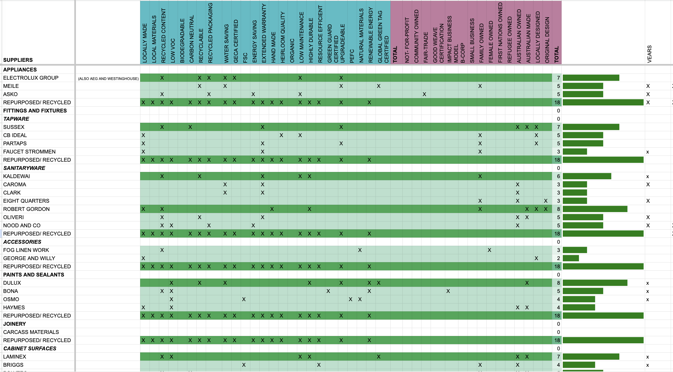
Our design team researches and assesses each suppliers ESG performance (Environmental, Social and Governance). We assess the Ecologically Sustainable Design (ESD) and Corporate Social Responsibility (CSR) policies and actions of each company prior to adding them to an internal directory. Information, links and documents are summarised for the team and tags are applied to the contact when they are deemed to satisfy our criteria. We only provide tags for substantiated claims. Our research methodologies include background research on ownership and governance structures, including parent companies, material safety data sheets, manufacturing locations and processes, product material breakdowns, corporate statements and programs. We also contact sales reps for further information not readily available, or in the case of smaller companies, speak directly to makers about their processes. These companies are then sorted by the number of criteria they satisfy, highest to lowest and added to our proprietary metrics table that rates the number of tags a supplier has scored from both the ESD and CSR categories. This allows us to compare suppliers and manufacturers against others when making selections and then check off those selections on a project-by-project basis comparing the quantity of best-choice selections used in a project. The best-performing companies are always at the top of the list and are the first place we look when sourcing. Not all products are equal! Each product we use from a supplier is entered into our online product library, where we enter specific product sustainability information, including uploading product safety data sheets. This information is then made available for discussion and comparison to the clients, builder and other consultants via access to our live online portal. 


OUR
Ecologically Sustainable Design (ESD) PROCUREMENT POLICY:

This Ecologically Sustainable Design (ESD) Procurement Policy outlines our commitment to selecting suppliers and products that meet high environmental standards. We positively screen our supplies through the following metrics to prioritize the following criteria when procuring materials and products to promote ecological sustainability in our architecture and design projects. We aim to select suppliers that are deemed to satisfy more than 6 of these criteria.

Local Manufacture:

  • We preference the procurement of products manufactured in Victoria or Australia. Products carrying the "Australian Made" and "Locally Made" tags will be given preference during the procurement process.

Local Materials:

  • Brave New Eco encourages the use of locally sourced materials in our projects.

  • Preference will be given to products made from locally available materials, supporting the local economy and reducing transportation-related environmental impacts.

Recycled and or Recycled Content:

  • We preference the procurement of materials with a high percentage of recycled content. Products with more than 20% up to 100% recycled materials will be favoured during procurement.

Recyclable:

  • We preference the procurement of products that are designed for end-of-life recycling.

  • Preference will be given to products that have a take-back program, are cradle-to-cradle certified, or can be easily disassembled for recycling purposes.

Carbon Neutral:

  • We preference the use of suppliers and products that are carbon neutral or have a positive impact on carbon emissions.

  • Preference will be given to products manufactured using carbon-neutral processes or companies that offset their carbon emissions.

Water Saving:

  • We promote water conservation and efficiency in the procurement of products and materials.

  • Preference will be given to suppliers who employ wastewater recovery in their manufacturing processes or offer products with low water usage.

GECA Certified:

  • We prioritise products that have obtained sustainability certifications, such as GECA (Good Environmental Choice Australia). b. GECA certified products demonstrate their environmental performance, including reduced environmental impact and resource efficiency.

Energy Saving:

  • Brave New Eco encourages the selection of products that promote energy efficiency or reduce the need for energy consumption.

  • Preference will be given to products that are energy-efficient in their use or contribute to energy savings in the built environment.

Biodegradable:

  • Brave New Eco preferences the procurement of materials and products that are biodegradable and capable of breaking down when composted. Biodegradable materials contribute to the reduction of waste and environmental impact.

Organic Materials:

  • Brave New Eco preferences the procurement promotes the use of naturally occurring organic materials over synthetic or man-made alternatives.

Low Maintenance:

  • Brave New Eco favours products that require minimal sealing or maintenance over their lifetime.

  • Low-maintenance products reduce the need for additional resources and contribute to long-term sustainability.

Low VOC/Non-Toxic:

  • Brave New Eco promotes products that have low VOC (Volatile Organic Compounds) emissions or are non-toxic.

  • Preference will be given to products that meet or exceed industry standards for VOC emissions and are safe for occupants' health.

FSC Certified Timbers:

  • Brave New Eco supports the procurement of products that are Forest Stewardship Council (FSC) certified.

  • FSC certification ensures that wood and wood-based products come from responsibly managed forests, promoting sustainable forestry practices.

Highly Durable:

  • Brave New Eco prioritises the selection of highly durable products that have a long lifespan.

  • Preference will be given to products known for their durability and ability to withstand wear and tear. 

Long Warranty:

  • Brave New Eco promotes the selection of products that come with warranties beyond the industry standard. 

  • Preference will be given to products with warranties of 10, 20 years, or lifetime warranties, indicating their high quality and durability. 

Handmade:

  • Brave New Eco values the craftsmanship and uniqueness of handmade products. 

  • Preference will be given to products that are meticulously crafted by artisans, contributing to the preservation of traditional skills and promoting sustainable livelihoods.

Heirloom Quality:

  • Brave New Eco preferences products that exhibit exceptional quality and have the potential to last a lifetime. 

  • Preference will be given to products that meet the highest standards of craftsmanship, durability, and timeless design, promoting sustainability through longevity. 

Upgradeable:

  • Brave New Eco preferences products that offer upgrade options to extend their lifespan and reduce waste. 

  • Preference will be given to products that provide replacement parts, refinishing services, or after-sale options to upgrade and enhance their functionality over time. 

Communication and Implementation:  

  • Brave New Eco will communicate this Ecologically Sustainable Design (ESD) Procurement Policy to all employees, suppliers, and relevant stakeholders. It will be implemented immediately upon approval. The policy will be periodically reviewed and updated to ensure its continued effectiveness and alignment with our sustainability goals.


OUR CORPORATE SOCIAL RESPONSIBILITY (CSR) PROCUREMENT POLICY:

Brave New Eco is committed to corporate social responsibility and making positive contributions to society through our procurement practices. This Corporate Social Responsibility (CSR) Procurement Policy outlines our commitment to supporting various social causes and promoting sustainable business models. We prioritise the following criteria when procuring products and services to align with our CSR goals.

Not-for-Profit:

  • Brave New Eco supports not-for-profit organisations and their initiatives. Preference will be given to suppliers that operate as not-for-profit entities, contributing to social welfare and community development.

Community Owned:

  • Brave New Eco promotes the procurement of products and services from community-owned enterprises.

  • Preference will be given to suppliers owned and operated by the local community, fostering economic empowerment and community development.

Fair Trade:

  • Brave New Eco supports fair trade practices and the principles of ethical sourcing.

  • Preference will be given to suppliers certified as fair trade, ensuring fair wages, safe working conditions, and sustainable livelihoods for workers.

Impact Business Model:

  • Brave New Eco values suppliers that have an impact-driven business model.

  • Preference will be given to suppliers that prioritise social or environmental outcomes and integrate them into their core business strategies.

Locally Designed:

  • Brave New Eco promotes the procurement of products and services that are locally designed.

  • Preference will be given to suppliers that promote local design talent, fostering creativity and supporting the local design industry.

Original Design:

  • Brave New Eco values suppliers that offer original and innovative designs.

  • Preference will be given to suppliers that promote unique, creative, and original design concepts, contributing to the advancement of the design industry.

Family-Owned:

  • Brave New Eco supports family-owned businesses and their contributions to the economy.

  • Preference will be given to suppliers that are family-owned and operated, promoting entrepreneurship and generational sustainability.

Female-Owned:

  • Brave New Eco promotes gender equality and the empowerment of women in business.

  • Preference will be given to suppliers that are female-owned and operated, contributing to the advancement of women entrepreneurs and leaders.

First Nations Owned:

  • Brave New Eco recognises the importance of supporting First Nations businesses and communities.

  • Preference will be given to suppliers that are owned and operated by First Nations individuals or communities, fostering economic development and cultural preservation.

Refugee Owned:

  • Brave New Eco supports refugee-owned businesses and their integration into the economy.

  • Preference will be given to suppliers that are owned and operated by refugees, providing opportunities for livelihood and economic self-sufficiency.

Small Business:

  • Brave New Eco promotes the growth and sustainability of small businesses.

  • Preference will be given to suppliers classified as small businesses, supporting local entrepreneurship and economic diversification.

Australian Owned:

  • Brave New Eco prioritises the procurement of products and services from Australian-owned and operated businesses.

  • Preference will be given to suppliers that are Australian-owned, contributing to the local economy and fostering national self-sufficiency.
THE BIG PICTURE: OUR MISSION & OBJECTIVES by megan norgate

Our mission is to create beautiful, environmentally-resilient spaces that foster human health and happiness.’

KEY SOCIAL AND ENVIRONMENTAL OBJECTIVES  

Creative We suggest solutions that may be overlooked by many because they are not the business as usual approach.

Resourceful Frugality is at the heart of our design approach. We make the least possible change for the biggest possible impact. We use what we have around us first, by opening our eyes to abundance, nothing is wasted. We see the potential in everything.

Analytical We research and evaluate all of our designs and specifications for function, suitability and environmental impact. We don’t just make pretty spaces, we understand the scientific, economic and ecological background behind our decisions.

Aesthetic We are allergic to ugliness. It is impossible for us to create something ugly.

Holistic We design in a social and global context. We are working to a bigger picture of how humans will live in the future. We integrate many diverse concerns in a single solution.

Generous We are part of the solution. We share our knowledge openly. We desire that many others to learn from our methods. We are fascinated by people and the environment. We seek constantly to understand how and why we can make life better for people.

BIG PICTURE OBJECTIVES (WHY): 

  • Intergenerational equity: To design to avoid using the resources future generations will need for safety, survival and prosperity

  • Human’s ecological imperative: Humans potentially have a symbiotic role within nature’s eco-systems rather than a parasitic one    

  • Facilitate social change: Reducing human consumption to safe and sustainable levels, eradicating wasteful and inefficient use or resources

  • Empower and Educate: Leave organisations/ entities/ individuals with the resources and ability to adapt to a changing ecological reality

  • Economic security and feasibility: Action plans that create a stable economic environment by encouraging optimum efficiency, and by providing future protection from scarcity of resources and the associated increase in costs

DESIGN AND STRATEGIC OBJECTIVES:

  • Autonomous: They function with minimal input of materials and energy

  • Adaptive: Can be changed over time to suit diverse uses, changing climate and technologies

  • Engaging: They encourage human-to-human and human-to-nature interaction. It’s about being positive about the world we live in

  • Organic: We favour materials that do not cause harm to humans or the environment

  • Ecologically active. Our designs incorporate living ecologies and respond intimately to the surrounding environment

HOW WE ACHIEVE THIS:

  • Work with nature and site ecologies

  • Minimise waste

  • Re-purpose others waste

  • Make the least change for the maximum ecological gain

  • Co-operate and don’t compete with what resources already exist

  • Consume less of a greater quality

  • Build and design for the entire life cycle

  • Preserve, regenerate and extend what exists already

  • Source firstly from existing resources and secondly from sustainable products 

  • Future proof: design for diverse use and changing needs

  • Consider embodied energy and ecological cost in purchasing choices

  • Design for resource scarcity

  • Harvest and dispose of water on site

  • Generate energy onsite by renewable means

  • Increase biological diversity

  • Create physical environments supportive and beneficial for human health and psychological wellbeing

  • Value human knowledge and skills

  • Find solutions within problems

  • Start small and learn in process of change

  • Empower and educate all individuals to make the changes, share knowledge generously and the responsibility equitably

Blue Larnoo by megan norgate

When Maggie and Pete bought their West Brunswick home it looked and functioned like two mirror image single fronted Victorian homes squeezed into the house, with two kitchens, two dining rooms, two laundries, two everything! This curious setup was the design of the previous owners, two brothers and their wives who lived side by side in the double-fronted, double-story Edwardian. 

While very cute and unique, the dual-living nature of the home created a rabbit-warren feel when consolidated with many doorways, hallways and extra rooms and several ways of getting from the front door to the back, none of them intuitive and one that passed through the main bedroom! This maze of a floorplan meant that despite the generous size of the home our clients, a family of five, were finding the spaces closed in and pokey. 

Our brief was to unite the spaces with a practical flow that would create a sense of openness and connection to the north-facing backyard. Our clients wanted the renovation to feel warm, filled with natural light and materials. Cosy and comfortable interiors and a big beautiful deck, would make the house welcoming and ready to be lived in.

As usual we sought to resolve all of the functionality issues with the minimum of new build, focusing on reconfiguration and revitalising the existing home. All that was added onto the Blue Larnoo footprint is this 2.5m2 bay window that opens the living area out to the deck and breaks up the rear elevation of the house that looked like ‘Peppa pig’ face with its twin windows and doors.

A projector screen hidden in the ceiling of the bay window pulls down to transform the space into an evening entertainment area meaning there is not need for a TV in the space.

In the rear of the home, the two kitchens were removed and onsold for other projects. The central dividing wall between these twin kitchen/ living dining areas was removed and replaced with two gently curved apertures to open the spaces, creating a connection while maintaining a sense of specific use.

On one side a new kitchen revolves around a blackbutt timber island bench with a curved tiled return. The benchtop is a porcelain panel made from natural materials and contains no silica or sealants. There is enough space to seat all three kids and their respective homework assignments.

The kitchen draws and cupboards are finished in a smokey green-grey toned laminate on birch plywood with subtle waves of graining. Overhead cabinets are an eco-certified blackbutt veneer, induction cooking has replaced a gas cooktop. All the kitchen storage and appliances have been designed to our client’s exact specifics of living, resulting in a kitchen that is a joy to use but also looks good from all the angles it is visible from.

The clients wanted the kitchen to directly access the garden and the spotted gum deck was also built connecting the indoor kitchen to a custom-designed outdoor kitchen, with its own sink and BBQ. A covered pergola was used for summer shade and to screen a neighbouring house.

Sliding doors connects the kitchen to an outdoor dining area on the large sunny deck.

We love the sense of connection to the outdoors. The outcome of the project exceeded our expectations, both in terms of function for our family and how much pleasure we derive from living in such a beautiful space. We feel incredibly lucky that this is our home!
- Maggie and Pete

Existing homes often provide unexpected opportunities in their little nooks and crannies. The space below the staircase serves to divide the kitchen and living, and we created double-sided storage for the day-to-day clutter, a corkboard and a fold-away ironing board. It is now one of the most used and hardest working areas in the home.

During the demolition care was taken to preserve intact even materials that would not be reused in the renovation, such as the kitchen bench, for the owners to resell, limiting waste created. 

Existing materials, features and appliances were reused and repurposed wherever possible; original hardwood floors and stairway, sanded and resealed and given a new lease on life. Skirting, cornices architraves that were removed were saved and reused. The sink and mixer from the laundry were reused in the laundry and bbq area, the ensuite toilet was kept in place. 

All new windows were double glazed the entire home insulated and the home has a 6.6 star rating. 

Beyond the kitchen is a dining area where strategic windows capture garden views while avoiding close-by neighbours. Double-glazed windows are installed in careful locations throughout the home to maximise natural light, ensure privacy and provide cross ventilation. 

A hand-woven Pop and Scott Dreamweaver pendant sits above the dining table and creates a beautiful ambiance. Pop and Scott is a Carbon Neutral Melbourne-based business, a tree is planted with every purchase.

Many elements were given a transformative cosmetic lift rather than being replaced, and colour and paint was the key tool in this. A complex paint scheme for the whole home inverted the previously tired walls and yellowing hardwood timbers. A palette of blues, aquas, teals and greens was created by the team at BNE to really deliver on Maggie’s brief of blue, blue and more blue. Paired with paired with blackbutt timbers, neutrals and pops of orange, the spaces are both calm and fun. The internal stair was opened up and daggy banisters were painted to give them a new lease of life.

Two interconnected front rooms, acting as a TV lounge and a study had a very different mood to the rest of the house. We leaned into these by painting them two shades of moody teal is a dramatic yet tranquil touch for rooms intended for both work and rest.

We love the cosy and inward-facing aspect of the TV room
- Maggie and Pete

Blue tones follow you into the ensuite, wall tiles in a mixed gradient of light blues are again paired with custom designed solid blackbutt timber vanity. A custom resin showerbase manufactured from natural minerals sits transparent and flush with the floor tiles, the non-toxic material is durable, hygienic, repairable, renewable and easy to clean. Low-flow tapware will save thousands of litres of water every year. 

Outside the laundry window is a green screen of bamboo, inside three different types of tiles add texture and colour in contrasting white and green wall tiles and floor tiles in terrazzo with rounded stones like a river bed. 

The laundry opens out to a clothes line for maximum convenience and when the weather turns an inside hanging drying rack can be used to save the dryer usage. Two new 4000L kingspan water tanks collect rain water to run the washing machine and toilets and irrigate the garden.

Blue Larnoo Sustainable Bathroom Renovation

Upstairs, attic space was reclaimed to create a larger bedroom for the families eldest child. The step up in floor levels here was used to create a nook for sleeping, with a big skylight to watch the stars and could from. Yet another lovely blue was chosen for this room. Next door the rest of the attic has become a band rehearsal hang out zone!

A large shed was replaced with a smaller but much more functional multi-purpose room that is both bike store/ workshop/ studio and rumpus area in the backyard. The bespoke osb timber lined shed is set back from the rear laneway to allow to access with bikes with a handy keypad, improving the laneway amenity for the owners and neighbours alike. The back of the shed is fitted with a roller door, ready to charge a car in the future.

The OSB lining, a large polycarb skylight and cement flooring give a cool and contemporary touch to the casual space.

What stands out to us is not one aspect but the way in which a multitude of small smart design decisions, tailored to the specifics of our family life, have enhanced not only the way we live in and use our spaces but also our overall enjoyment of them- given how beautifully they have been resolved
- Maggie and Pete

6.6 Star Energy Rating

  • Minimal 2.5m2 extension to original footprint 

  • New efficient BINQ double glazed windows added for improved solar access

  • Skirting, cornices architraves that were removed were saved and reused

  • Added additional insulation 

  • Energy and water efficient appliances

  • Induction cooktop replaced gas

  • Lowflow tapware

  • Stainless steel kitchen mixer to avoid toxic chrome, reused laundry troughs and mixers in bbq and laundry to avoid waste. Reused existing toilets in new ensuite and powder

  • LOW VOC paints and timber sealants

  • original hardwood floors and stairway, sanded and resealed

  • Two new 4000L kingspan water tanks collect rain water to run the washing machine and toilets and irrigate the garden

  • New solar operated double glazed skylight in upstairs bedroom

  • Australian Radial sawn silver top ash shiplap cladding to extension

Lovely Laura the Second by Anna Scharf

Lovely Laura ‘the second’, is the second Victorian cottage we have designed a renovation for on this very same Brunswick street. The dear old 1885 single-fronted home was full of character but lacked functionality. She was a bit dark, needed to be updated for energy efficiency and past renovations were showing their age. Our clients Corina and Lorcan came to us for a renovation of the kitchen, bathroom and laundry that would feel timeless alongside the original elements of the home and preserve the charm and personality.

The kitchen sits at the rear of the cottage between the rest of the house the back courtyard, it needs to function as both a utility space and a thoroughfare. The layout was critical, as to not either block the connection with the outdoor space, or make the kitchen dysfunctional. To resolve it we put two galley-style elements in on opposing sides, each with a different purpose. One side it the workhorse side, where all the heat, water and mess is created containing the fridge, cooker, sink, bins and drawer dishwasher. This is really a self-contained small kitchen of its own right.

Corina had her heart set on a Belling Richmond Delux induction cooker, a beautiful high-quality cooker with a high-energy rating but at 90cm wide it takes up room. Additionally, Lorcan is an avid home brewer whose kegerator was also taking up a lot of precious bench space as well as contributing a “uni-house feel” (Corina’s words not ours!). A combination of open and closed shallow shelving on the opposite side is what gives this small kitchen extra amenity and allows the space to be inhabited fully. There is efficient storage space for pantry crockery equipment. A bench-height custom-made table is nestled in the shelves creating a dining spot, and extra food prep space for those bigger brewing and baking tasks. In between these elements, large french doors open to the back and fill the space with light.

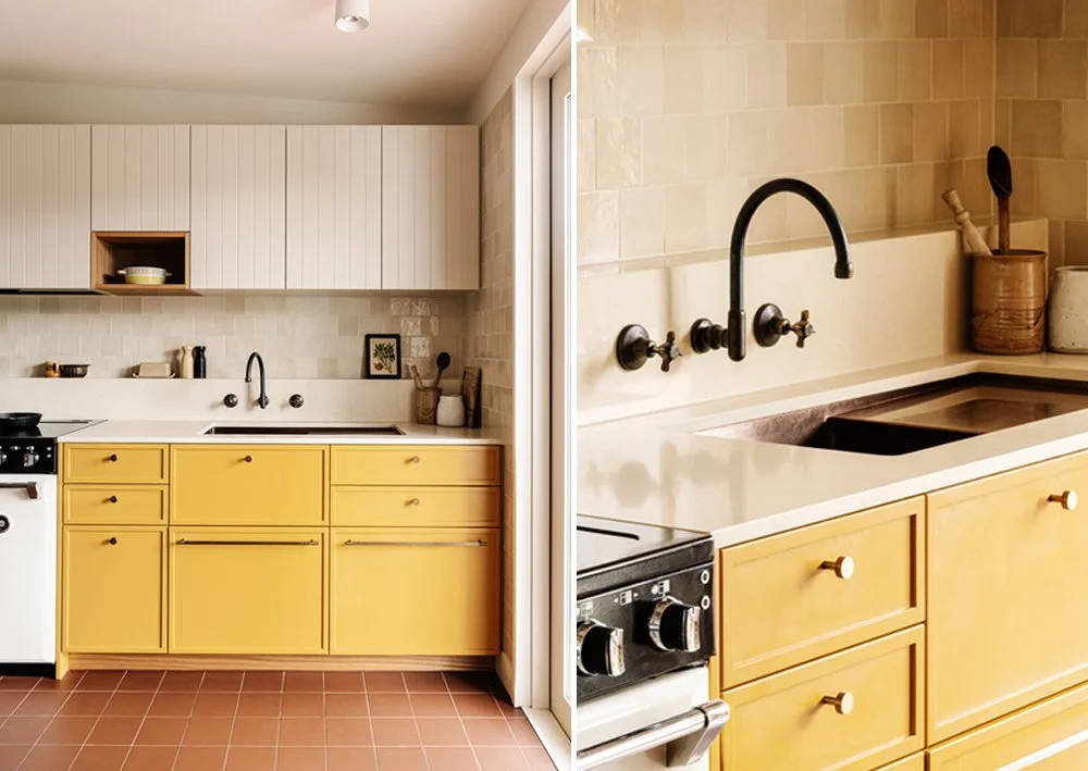
We took inspiration from the cottage’s original colour scheme; sunny yellow, terracotta and warm timber are complimented with elegant warm neutrals creating a feel-good cohesion throughout the renovated areas. In the kitchen the under bench cabinets were painted a joyful Dulux Deep Sun. Wall tiles in textured beige each vary slightly in shade, giving a depth and handcrafted feel. The bathroom and laundry features the same palettes with yellow and white wall tiles, terracotta flooring and timber touches.

We selected fixtures and finishes that were both sustainable and high quality, ensuring durability. Installed in the kitchen and laundry are buttermilk stone bench tops in quartz, a non-toxic, eco-friendly material that feels timeless and is incredibly long-lasting. Tapware is low-flow and locally made in weathered brass; the handles will soon shine golden with daily use, blending it into the 138-year-old home around it. Cabinets were fitted with knrled knobs and pulls in bronze. Sinks in the kitchen and laundry are a brushed copper finish and the bathroom sink is a fine fireclay. Fireclay is long-lasting natural material stronger and less brittle than ceramic. Lighting fixtures feel fresh and tasteful. In the bathroom a locally made cloche light from Porcelain Bear and in the kitchen, a ceramic pendant light from Muuto.

In the laundry we fixed what was originally a kitchen problem, Lorcan’s Kegerator was taking up precious kitchen bench space, it now lives around the corner in the laundry, out of the way and out of sight.

Energy efficiency is important to Corina and Lorcan, they had already installed solar panels and had their rainwater hooked up to their sprinkler system. Continuing this good work we installed insulation, double glazing and ceiling fans. We also installed a drying rack in the laundry, low-efficient appliances were switched with energy-efficient replacements and maximised natural lighting.   

Our clients were thrilled with the end result “Beautiful, homey and timeless, we wanted a renovation in keeping with our home and it’s just perfect”, says Corina. We think so too, by focusing on timeless design and materials that felt warm and joyful we gave this beautiful cottage an update that held true to the original while making it a more efficient and liveable space.

COSYCO. The love bubble project. by megan norgate

The handsome solid red brick Californian In Coburg in Melbourne’s North was inward looking with a shabby asbestos-clad lean-to extension closing it off from the garden. The clients, Sarah and Ben love living and eating outside so wanted to improve the connection to the garden and carve out a space for sheltered outdoor dining. They imagined a laundry for muddy gumboots and glass jars full of cuttings, a kitchen that can work hard, looking equally good when in chaos or clean and tidy.

The clients wanted a home bathed in sunlight; a space that felt generous, retaining the lofty spaciousness of the existing period home. A home for a family to grow with spaces that allow for separation and connection. A home that allows the family to be within reach, sight lines to children whilst allowing autonomy. Rooms for the family to retreat to and a guest room for out-of-town relatives to stay.

The interiors are the antithesis of a soulless display home. We worked to make them warm and lived in and welcome existing treasures passed on through the generations. Sarah and Ben’s house existing home was joyously curated with a mishmash of old and handmade, each item much loved and with a story attached and we wove this idea into the new spaces.

The challenge was to cohesively blend the charm of the existing heritage home with the contemporary extension. The rear layout of the house was flipped so that the kitchen/living/dining all interfaced the garden. Balancing the client’s desire for connection and privacy. This project was a dream collaboration where the Architect, Interior Designer, Client and builder all worked together to carve out a form and, together slowly honed each detail to create a whole.

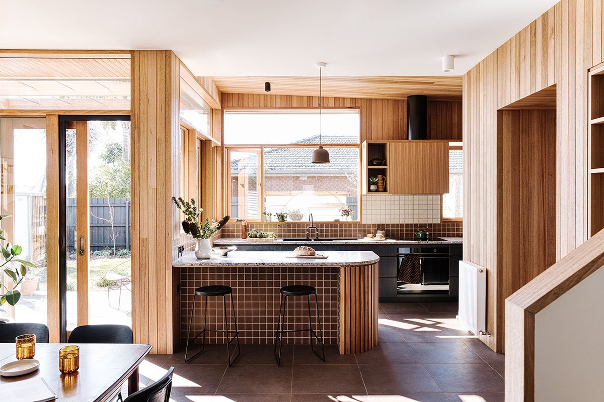
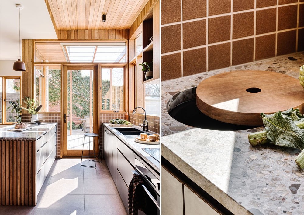
In the kitchen the beautiful benchtops, like a river bed of polished stones, informs the palette of the kitchen. Warm, earthy colours with subtle textures effortlessly hide the fingerprints and smudges of a well loved kitchen. The gunmetal sink overlooks the garden, a perfect spot to bask in the sunlight whilst tackling the morning dishes. The dark brass tapware is rubbed golden at the handles from daily use.

The open pantry allows the little bit of functional chaos of family life to be tucked around the corner, leaving the spacious bench uncluttered. Appliances are housed in their cosy nook, with open shelves keeping pantry items in easy reach. The compost bin is recessed into the bench, with a pretty little custom timber lid. The handless laminate cabinetry with provides a robust, low maintenance surface; its subtle charcoal wood grain texture providing depth and character. The generous amount of drawers reduce the need for overhead cabinets (that are notoriously hard to reach) instead prioritising full-height windows bathing the counter in sunlight.

The organic browns of the Japanese tiles anchor the island bench to the cinnamon floor, the perfect scuffproof surface for kids perched on stools. The timber lining boards glow golden in this light drenched room, the warm variation in the wood creating highlights that complement the eggshell speckled splashback and ceilings painted in Dulux Grand Piano.

Layering and playing with levels helped us achieve the balance between privacy and connection. Early iterations had the living and dining closed of from each other, but an inspired suggestion by the clients was to open this up to the kitchen. This idea developed into one of our favourite features - the open shelving and record cabinet, a home for Sarah's beautiful objects and Ben's beloved records. 

Stepping down to the kitchen level, the hardwood framed doorway is a threshold from old to new. It seamlessly folds down to form the banquette seat. The unifying colours of the beautiful wool plaid echo the cinnamon of the floor and organic mid century tones terrazzo benchtops. Aside from being a cosy little nook to enjoy the morning sun, the built in seat is one of the many space-saving tricks we utilised to maintain a spacious feel to the house whilst keeping the footprint compact.

Dubbed the "love bubble" during lockdown this house was conceived over many zoom meetings during the pandemic and while welcoming a new baby Peggy May. Beside the dining is a study nook, a place for new bub Peggy to play while her parent's cook, a built-in seat with storage for toys. This clever joinery item pacts even more into a small space - keydrop, charging drawer, modem cupboard, corkboard and art display.

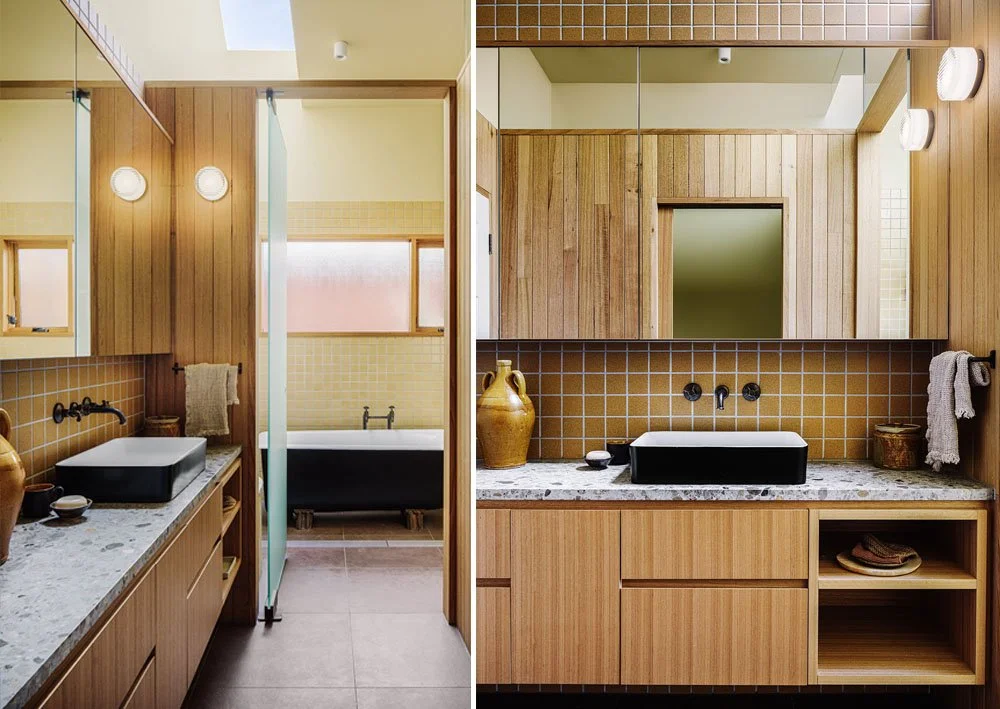
The bathroom, which was relocated to the original kitchen site adjacent the carport, could have been dim and cold. The bathroom is a series of stalls, and could practically be used by three people at once privately. Megan was inspired by campground shared bathrooms, where you have space to dress and a little seat in your “shower cubicle”, so the bath and shower are in their own room with large sandblasted pivot door, and the vanity and WC have their own spaces as well. Light is shared throughout the spaces by open/ glass tops to Timber clad walls and a heavenly slice of light from a long blade skylight that bridges the wet area spaces.

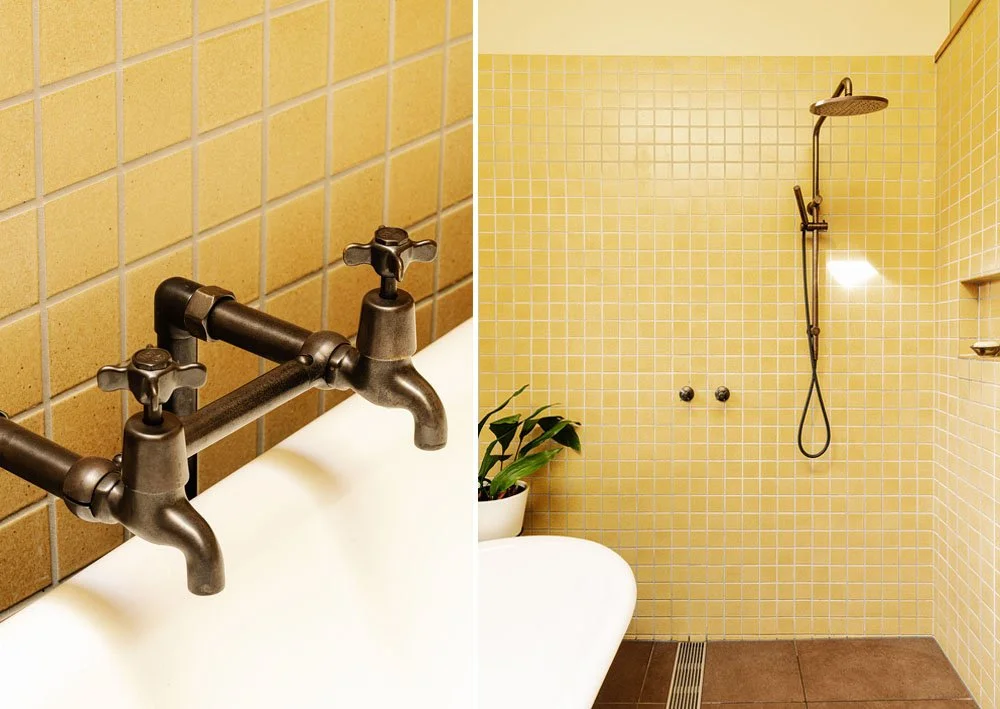
An old family pig’s- trotter foot bath, transported from the country to its new home became a central feature. The white interior and black exterior was inspired black and white ceramic basins which and dark chocolate brown antique brass tapware. The richness of timber lining boards and buttery Japanese tiled walls the space becomes divinley warm and is one of the clients favourite places in the house.

Gentle curves are echoed throughout the project. From the timber-lined island bench there is a layered view through to the hallway door with its semicircle window above. Beyond this, the custom security door can be seen, inspired by an art deco railing spied during a lockdown 5km stroll. In the family bathroom the Japanese tiles hug the curve of the terrazzo-topped seat. Upstairs the architect's lovely undulating curved screen conceals unwanted views whilst revealing beautiful sky and treetops.

The warm palette continues into the laundry. Nestled under the stairs there is a generous amount of linen storage. There is even room for a cosy dog bed fo Pam the beloved family dog who can come and go through her special dog door in the double glazed door. Natural drying is made easy even on the rainless winter’s day with a custom rail above the sink and a hanging drying rack.

This project was a dream collaboration where the Architect, Interior Designer, Client and builder all worked together to carve out a form and, together slowly honed each detail to create a whole.

WORDS BY NICOLA DOVEY- ARCHITECT:

Due to the way the site was set up, and because we wanted to keep the new extension to as small an efficient footprint as possible, we had a particular building envelope we needed to work to, to wedge in the upper level. This second level houses the parents’ bedroom, ensuite, study nook and window seat. There was also the opportunity to set up a small sunny balcony, just deep enough to create a sheltered space underneath and to help cocoon the edge of the bedroom, obscuring views of the neighbours backyard and to create a soft habitable edge for a chair and plants. The envelope we had to work with meant we needed to create a minimum height point a the top of the stairs, to offset this we took the ceiling line of the parents bedroom ceiling up over a lofty 3m. The views from the upper level are dramatic, spreading around from a sea of northern roof tops & chimneys out to the ranges over to the east. Generously sized windows set up in each of the upper level rooms really highlight Melbourne's geography. The sizeable window in the new ensuite gives an immediate view of the character laden moss covered original terracotta tiles and roof spinals. The clients were interested to know how the new might sit alongside the existing in a comfortable way. The existing was a red brick Victorian with a relaxed bungalow entrance and an Arts and Crafts timbered & stucco facade. These existing timbers had been painted in pale eucalyptus. We layered the old and new materially but setting up the new addition with a brick base. Brick is a robust building material, not needing maintenance and providing beneficial thermal mass. Here we sort a contrast between the existing deep red brick and a crisp clear white brick. The upper level was matched in robustness by metal standing seam cladding. The colour palette here extends the pale eucalypt colour in Colourbond Cove. Warm and character laden timbers in Blackbutt were used for the pergola and decking boards. In the spirit of interest and contrast, we incorporated a few playful curves, into the balcony screening, in the external timber bench seat running along the dining table window, that conveniently opens up to store toys and tools, and in the timber step leading down from the sunny living room. That so much amenity has been shoe horned into such a small (new build) footprint is quite extraordinary! The benefits of small footprint design is two fold, it saves on resources which saves clients in the build price but also allows the backyard to stay large, generous and abundant.

Sustainable features of the house:

  1. Drying racks in the laundry and fold down washing line reduce the need for power hungry dryer.

  2. 2x4000L slimeline water tanks pump back to laundry and toilet flushing

  3. Compost bin built in to kitchen bench top

  4. Repurposed existing sliding doors to cosy lounge. Re-used existing clawfoot bath. Re-used Sarah's grandfather's bakelite shed handle to hallway door.

  5. New windows timber-framed Argon-filled double-glazed windows.

  6. Replaced drafty original floors in the existing house with new floorboards, insulating underneath the floors throughout

  7. Adding wall and ceiling insulation throughout

  8. Healthy radiant hydronic heating.

  9. Living, dining and kitchen areas oriented to the north. Glazing to south and west minimised.

  10. The passive solar design includes fixed shading to the north for the summer sun.

  11. Passive ventilation includes security door to front door for night purging.

  12. Installed ceiling fans throughout.

  13. Lined curtains

  14. LOW VOC paints and timber sealants.

  15. Brass tapware and door hardware- no chrome. Locally manufactured.

  16. FSC certified engineered floorboards.

  17. Used low maintenance exterior colorbond cladding and brick to reduce maintenance.

Digital Feaures
Dwell - The Neighborhood Was Great. But the House Needed Help to Become a Family Home
The Design Files - A Sunny, Nostalgic Extension For A California Bungalow
The Local Project - Connected Warmth, CosyCo by Drawing Room Architecture and Brave New Eco
Hunter & Folk - CosyCo Coburg basks in sunlight, warmth and the timelessness of home

heritage electric by megan norgate

Our clients came to us with renovation concept plans for an extension by Logan Sheild of Geometrica, containing a new living room, new outdoor living space and refurbished kitchen, bathroom and laundry. At the time we were too booked up to take on the project, but they were wonderfully persistent and waited for us to come on board! They were happy with the overall layout however were looking for some detailed designs and specifications for the interior components. The brief to create a contemporary space full of high-quality functional details, using sustainable design strategies and converting the home to all electric energy.

“We were struggling to resolve some key layout decisions when we originally approached the BNE team, including the orientation and layout of the kitchen and laundry to ensure practical and well-connected spaces with sufficient storage. BNE were able to suggest a number of design updates that addressed these concerns and we are extremely pleased with the outcome. Megan and her team have done an impressive job understanding our requirements and translating these into beautiful and practical outcomes. They also helped us to form a realistic understanding of how best to approach the design process and not rush into making decisions too early.”- (client)

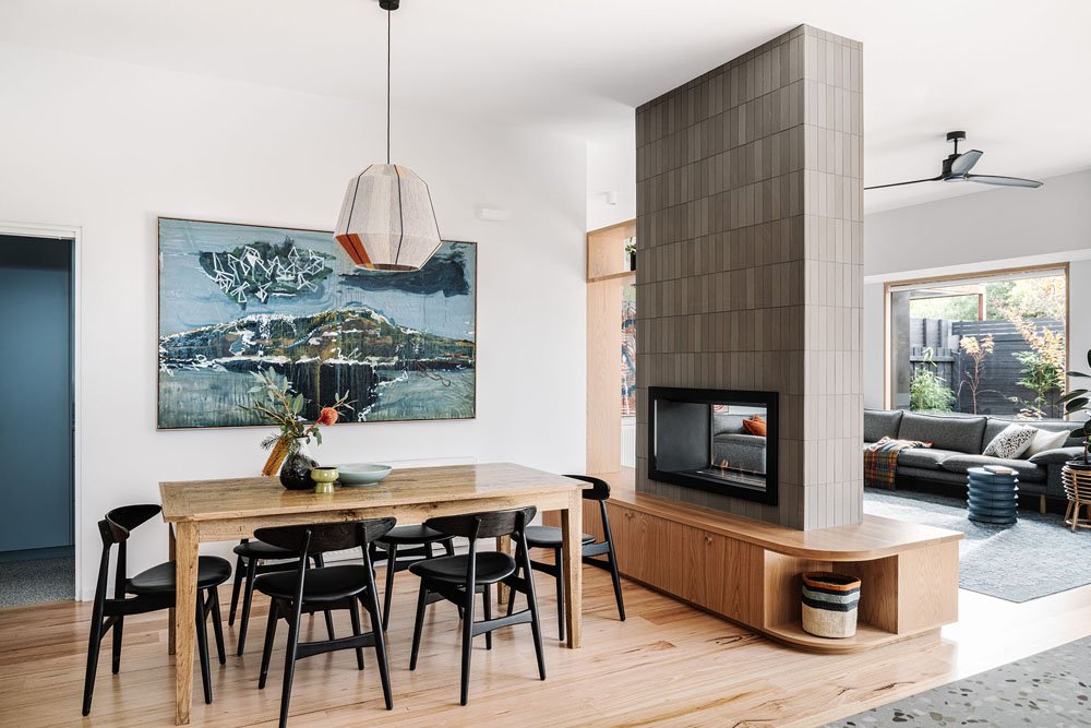
The overall size of the existing home was about right, but the layout was problematic. The rear of the house backs faces north and backs onto a lovely parkland borrowing the landscape of the parkland trees. The original house was hemmed in by a bathroom and laundry at the back, so key to the spatial planning was to open the living areas to that northern aspect, bring in more natural light and facilitate cross-flow ventilation. Creating workable spaces with privacy and acoustic separation as the young family grows was also a priority. We configured the new rear rooms as interconnected spaces, separate but linked, to provide delineation while maintaining a sense of openness throughout with a strong connection to the outdoors. A central ethanol fireplace and FSC certified American oak joinery unit separated the living form the dining spacially but allows views through dining to the rear garden.

Sustainability and utilising renewable energy were very important to the family. We tread a fine line between retaining what we could change or build without unnecessary waste and creating a home that will serve the current owners well into the future. We used recycled solid hardwood Wormy Chestnut flooring to go throughout the hall extension which is a beautiful warm feature.

The gas kitchen was converted to all-electric using heat-pump hot water and induction cooking all running on renewable energy. Heat pump hydronic heating, and high-performance Miglas double-glazed composite windows specified by Logan really elevated the energy efficiency of the project. The warm hardwood timber on the inside makes these windows thermally efficient (and beautiful) while the aluminium exterior frames are durable and maintenance-free. There are composting systems in the kitchen, air drying stations in the laundry, insulation in the ceiling, walls and floors, double glazing in the windows, ceiling fans and led lighting.

We made use of a large range of tiles formats and surfaces, however, kept them within a palette of grey, blacks, white, pale, navy and teal blue and the pops of orange so the result is a very calming contemporary atmosphere. It is more subdued than our usual approach with colour but is really lovely in person as the textures and slight tonal variations create subtle shifts in tone.

“I find the living area a really rejuvenating space to be in now. A few people have commented that the colours and finishes have a calming effect. It's so lovely to sit in the living room during the day and feel so connected with the outdoor spaces. It's also amazingly calming sitting in the living room at night - the lighting, colours and spaces that we can see from the living room.” Client

The existing rooms were generous so we were able to put a dining space and laundry within one oversized dining room. The ceiling heights were voluminous and had been dropped in a previous low-quality 2000's kitchen renovation, we lifted them higher and brought the whole living area under one height creating an open, cohesive flow between the old and new.

The front hall was dark, so we worked with the builder Stan during the build to add an oversized glazed tilt panel door that looks right through the house into the garden. and made a feature of the period mouldings by painting them a soft grey.

The clients had completed a previous micro renovation of their bedroom, adding an ensuite (pictured below right) by our friend Imogen Pullar for Drawing Room Architecture. The was relatively new and we didn't want the full renovation to feel like it was piecemeal so we included the colours and material palette that Drawing Room Architecture had established as part of an overall palette and made these elements work with our design solutions.

We have added locally made and custom furnishings, window coverings, loft beds, and decorative items to complete the project, including two sets of amazing loft beds made locally by House of orange. Finally, the laundry had a separate WC at one end and super high ceilings, due to being in the original footprint. So we stacked the function of the WC enclosing the ceiling above it, adding a removable attic ladder to create a storage loft above. (We have also popped two drying racks up there as well, of course!).

“Our favourite things about the design are practical, light-filled spaces that are well connected with outdoor spaces. We love the finishes and colour scheme and are so impressed with how everything has come together. Even relatively minor updates such as new paint colours in the old unrenovated parts of the house have been central to ensuring the whole house ties together beautifully”. client

HERATIGE ELECTRIC
LOCATION: Ascot Vale Naarm
SCOPE: Sustainable extension containing a new living room and extensive reconfiguration/ refurbishment of existing home
CONCEPT + INTERIOR DESIGN TEAM: Megan Norgate and Kelsey Dabinett
BUILDER: Elder group
BUILDING DESIGNER/ARCHITECT: Logan Sheild of Geometrica
LANDSCAPER: Joel Feldman of Vale Living
PHOTOGRAPHER: Marnie Hawson
STYLIST: Brave New Eco
ARTIST: Nathan Feldman (left), Gareth Sansom (right)
SIDE TABLES: Zachary Frankel
COMPLETION DATE: 2022

WEST BEND HOUSE by megan norgate

brave new eco, sustainable interior design, melbourne interior design

West Bend House occupies an extraordinary leafy Westgarth site, meandering down into Merri Creek parklands. At its highest points the home looks out across the green wildlife belt to Rushall station and the city beyond. With the building resolved by Ant and his team MRTN Architects, the clients approached Brave New Eco to design and detail the interiors of their ‘forever home’ that they will inhabit with three teenagers and various guests for many years to come. The owners of the house were known well to us, they had been early clients for both Brave New Eco and MRTN Architects, believing in our respective studios in the early days. By this stage in our collaborative history with MRTN Architects, our mutual trust and respect levels were high - it was a great start to our third project collaboration. Simone Bliss Landscape Architecture and Lew Building were quality additions to this dream team.

Ant and his team conceived the home like a village on a hill. Oriented to the long East to West axis, the home follows the contours of the site, stepping up and down, wrapping around a sunken internal courtyard. The patterns of activity are extruded across the width of the house in a mostly open-plan format. Our challenge was to configure the interior elements so that each space feels cosy and settled and to add layers of detail to complement and build on the strong architectural palette.

This house is fully electric, with heat pump in-slab heating and a battery backup solar system. Rainwater tanks and solar passive orientation maximise the sustainable performance of the home.

Brave New Eco worked intimately with the clients and architect to design custom joinery and interior fit-out details throughout. Including the entrance, 3 bathrooms, bedrooms, laundry, study, dining, living, lounge, and kitchen. Much of the joinery for this home was custom designed for the space and the specific storage and lifestyle requirements of the family. We were able to sink deep into the functional and aesthetic details quickly, given our understanding of and great affection for the people who live here.

brave new eco, sustainable interior design, melbourne interior design
brave new eco, sustainable interior design, west bend house,

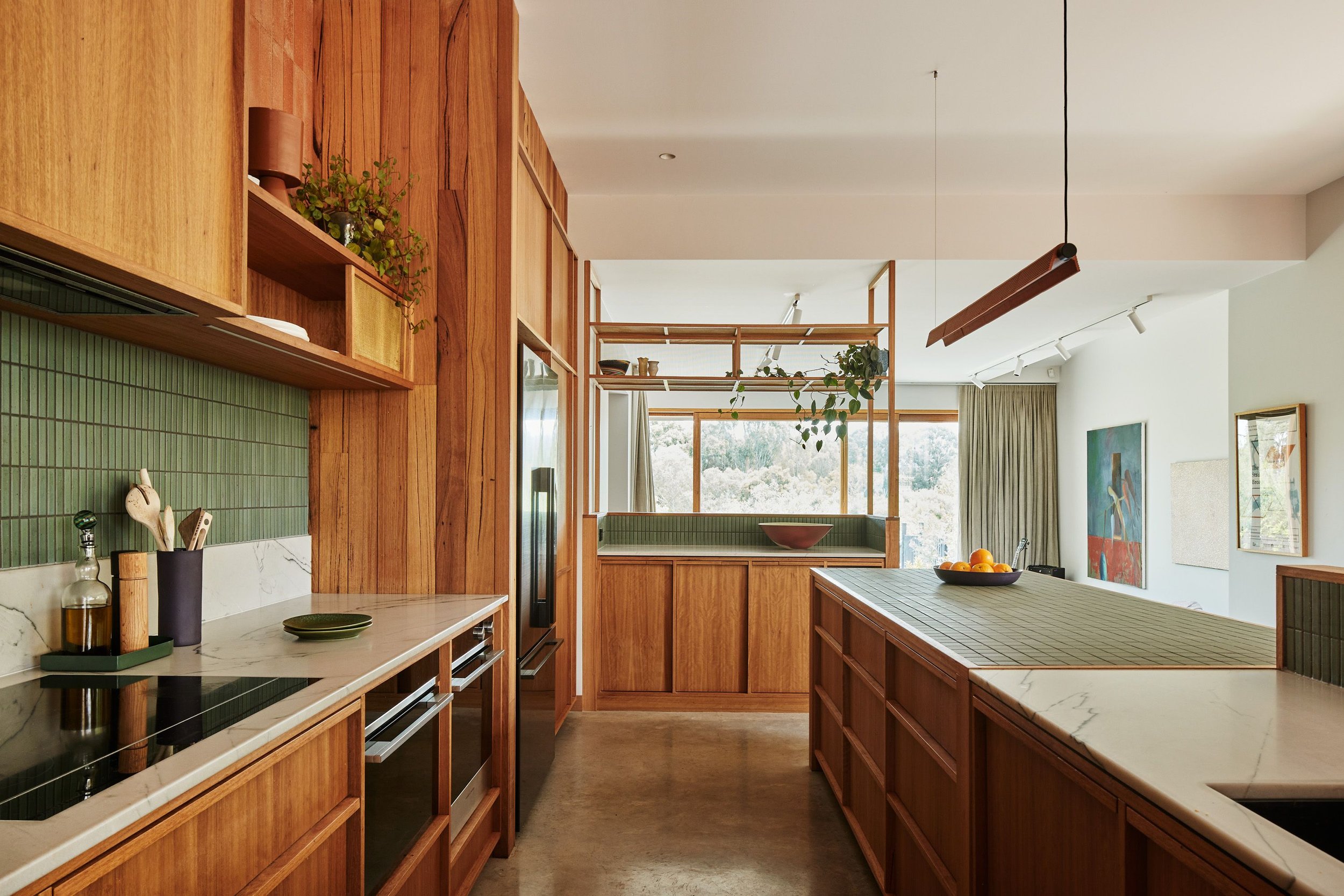
A warm timber galley kitchen wraps around a central, monolithic island - part kitchen table/ part workbench. Southdrawn's terracotta tile pendant illuminates the work area and a timber battened return keeps the dish zone out of view. The bench and joinery at the end of the kitchen capitalises on vertical volumes by cantilevering over the record station in the lower-level living area. Induction cooking and appliances by Fisher and Paykel support this fully electric house.

brave new eco, sustainable interior design, melbourne interior design

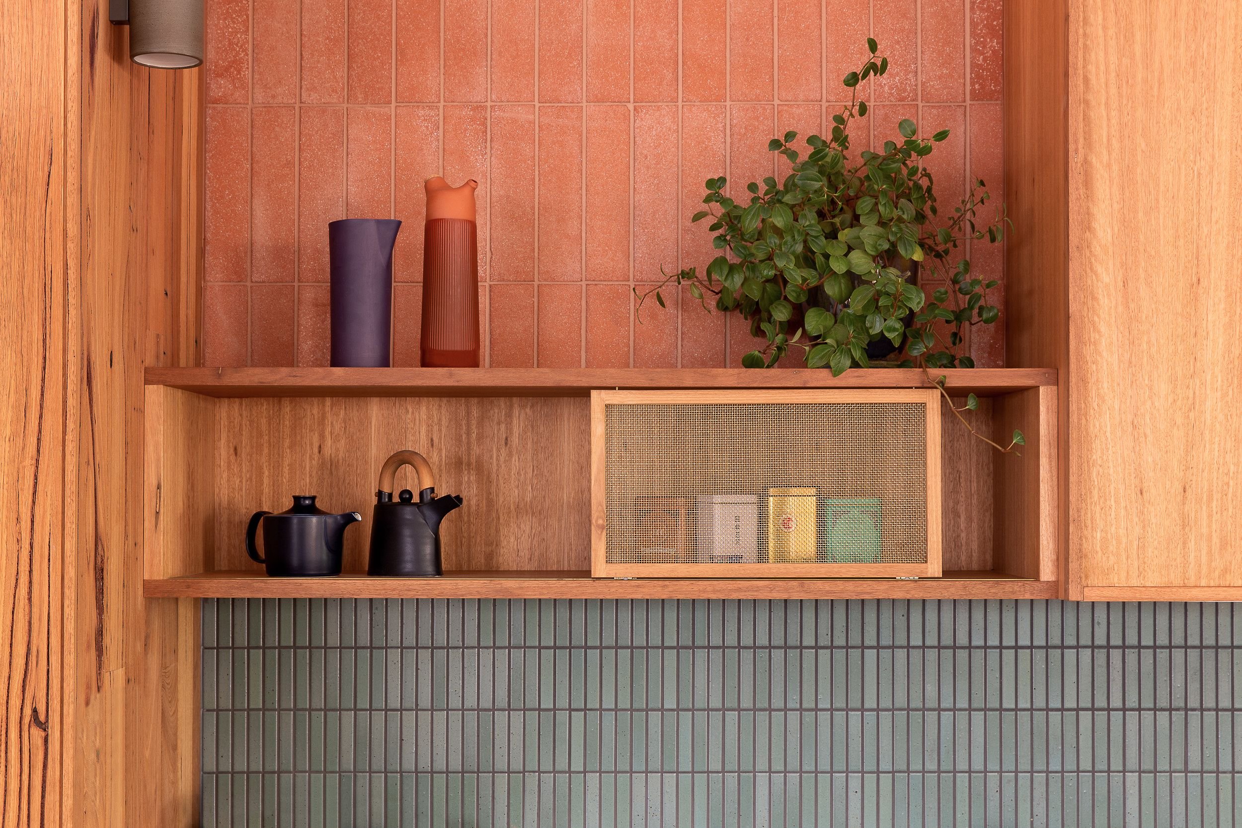
Sliding mesh screens on the shelves allow flexibility to conceal or reveal as needed. Three different types of tiles add texture and colour in contrasting terracotta and green.

brave new eco , sustainable interior design, melbourne interiors

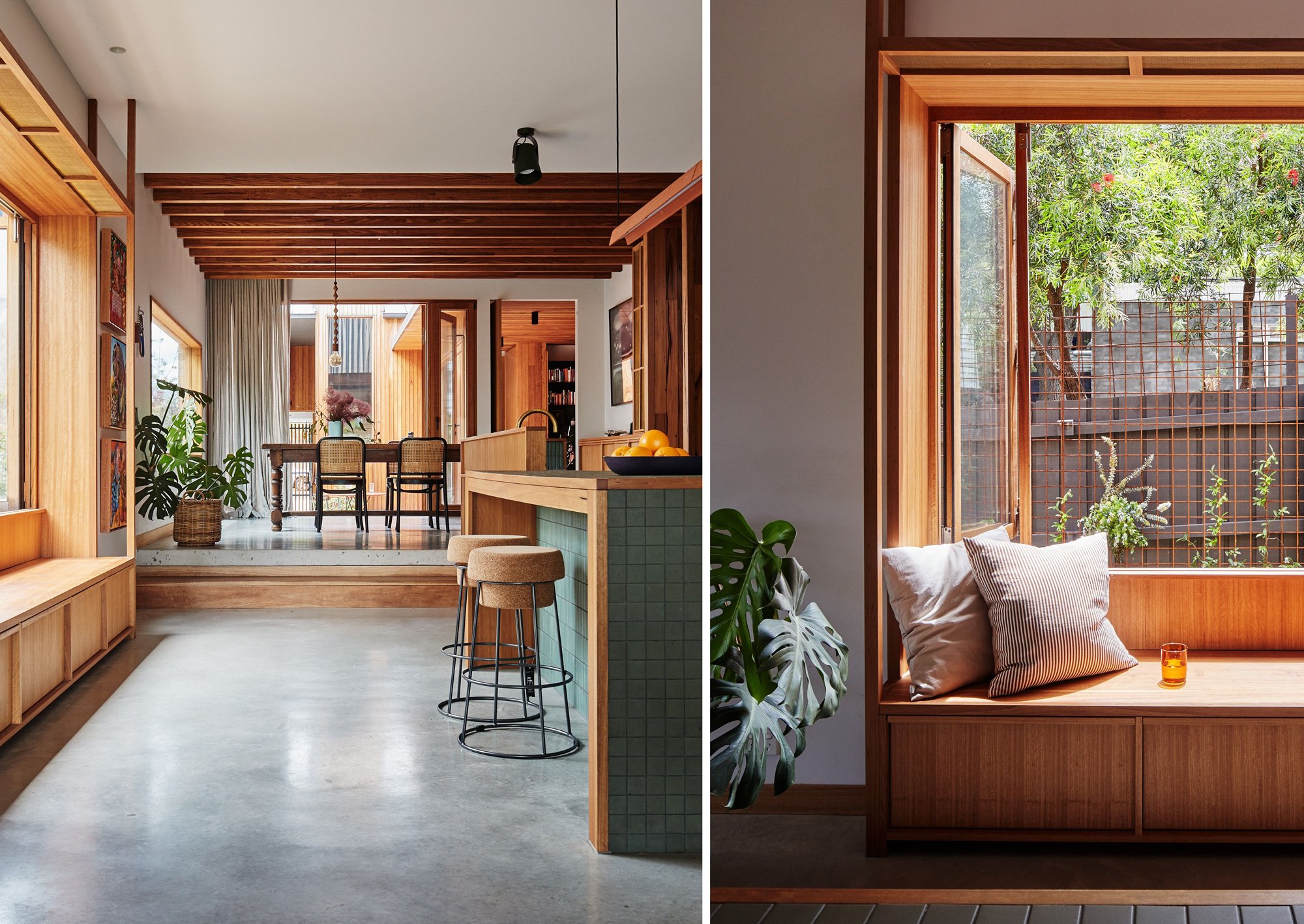
A kitchen window seat hosts a "bedroom repatriation" draw for each family member below, so accumulated things can be collected out of sight, to be taken to the appropriate bedroom by the owner. (An aspirational idea we stole from Ant’s own home!). Handles are concealed in the solid hardwood frames of the cabinetry. Pure brass mesh cupboard doors and shelves sit lightly in the spaces and will darken over time. Each cupboard and drawer has a specific intended use and these were mapped out with the owners in detail during the design process, including a specially designed narrow cupboard for the kitchen broom and brush and wine storage.

brave new eco, sustainable interior design, melbourne interior design

The cosy living is a retreat for TV and games, featuring plush teal carpet and a thick double-sided, acoustically plum cinema curtain to deaden sound. A custom-designed L-shaped timber settee has Italian wool seat cushions in two shades of army green. It is the kind of plush room where bodies will relax on the furniture and ground.

brave new eco, sustainable interior design, melbourne interior design

The handsome laundry contains integrated dirty washing baskets and pet food storage solutions. Custom joinery doors are finished in deep green Forbo Marmoleum - created from linseed oil, pine rosin, wood flour which are naturally biodegradable. One of our favourite products, it is also carbon negative from cradle to grave. Stacked mosaic tiles from Artedomus and concrete benches complete this particularly lovely space.

brave new eco

Adjacent to the courtyard in the central heart of the home lives a large family study with warm red brick floors. With a long desk for ongoing projects, this transitional space features soft pinboard backing and inbuilt timber cable runs to hide the ‘tangle’. A single timber shelf provides a ledge for artworks and dynamic display, to grow and change over time. Moveable mesh screens expose and reveal work-in-progress projects and materials, with a dedicated section to conceal printers and other equipment. A floor-to-ceiling library with Forbo Marmoleum backing, green powdercoated steel shelves, and hardwood timber uprights is a feature visible from many places in the home. The deep red tone of the brick floors flows upwards through the house, seen on the powdercoated steel staircase rail and carpet in the upstairs bedrooms. 

brave new eco, sustainable interior design, melbourne interior design

A bathroom shared by two sisters is tiled in 3 shades of warm terracotta porcelain tiles. Locally manufactured tapware by Sussex taps are a custom configuration - combining two different ranges into new forms, finished in living brass. A locally poured concrete bench in a custom colour mix of deep muted plum, completes the warmth of this room's palette. In a house that has so many communal spaces, the bathrooms each have their own distinct atmosphere that is quite dramatic due to the big use of a single colour, making them enveloping and intimate.

Upstairs a beautiful main bedroom sneaks views of the city. The bed is nestled against a floating walk-in robe dividing wall, finished in hardwood timber. A deep blue ‘bottom of the pool’ ensuite bathroom is a moody respite and features custom mirrors and a wall light by Ross Gardam. Soft warm greys verging on pale lilac paints were used throughout adding atmospheric changes to the zones and tonal hues.

brave new eco, sustainable interior design,

The story of this home's interior is emphatically local, layering a resolved palette of organic materials in diverse and sometimes unusual applications across the spaces. This approach continues as furniture and soft furnishings are added over time. Beautiful yet robust, playful yet grown-up, we think this home has captured the essence of the thoughtful, active, and creative family that inhabits it.

ENDURING HOUSE by megan norgate

brave new eco sustainable interior design megan norgate

'Enduring House' is a grand old double-fronted Edwardian Dame on a large north-facing side of a leafy street in Brunswick West. Her original features included a high-pitched gable roof, lead-lighting, pressed metals and twin pairs of clay chimney pots, typical of the era. Nick and Sarah had raised their sons in this tumble-down home with high ceilings and deep rambling garden for many years. As the family grew, the makeshift kitchen, leaky lean-to and a lack of insulation had lost its charm. 

More space and improving the energy efficiency of the building was needed. The family also wanted to future proof the home to adapt for multi-generational living with ageing parents in the coming decades. When Nick and Sarah came to BNE, they had previous plans for a period style extension that added a large second story. During discussions with them, we felt perhaps their wish list had been prioritised at the expense of their values. We were curious to explore whether we could achieve more functionality from a smaller overall footprint. The key to this would be thoughtful interior reconfigurations to the existing spaces and interrogating how some spaces could solve more than one problem. BNE worked with Matt from Green Solar Designs to resolve the schematic design of a two-story north-facing extension utilising the internal volumes of a gabled roof that would become a parent's bedroom, study, bathroom and WIR.

brave new eco sustainable interior design megan norgate

The four original rooms were reconfigured into two bedrooms, a second living room, a hallway coat and bag nook, a bathroom and a WC. The extension provided a new laundry, kitchen, dining, 3rd bedroom and lounge. The programming is efficient for the number of functional spaces (4 beds, 2 livings, a study, 2 baths and WC ).

The result is a proportionally balanced feeling home, with many diverse spaces while maintaining the deep garden. A sense of verticality and openness to the extension was sought. Pitched ceilings upstairs and long views through connecting spaces to the garden helped create this. Where possible spaces can be used and accessed in more than one way, creating a playful labyrinth of pathways to move through the home. The details BNE designed to evolve the spaces are both functional and beautiful.

brave new eco sustainable interior design megan norgate

A strong material base of hardwood timber, porcelain/ ceramic surfaces and brass details is continued throughout. Australian timbers and materials were prefaced, with all of the touch surfaces including architectural hardware and tapware in living brass.

brave new eco sustainable interior design

A smaller kitchen is made functional by an adjoining walk-through pantry that connects to the utility zone where the laundry WC, large linen press and bathroom can all be accessed. The pantry houses all the practical accessories of a busy kitchen including ovens, fridge, pantry goods and appliances so that the open-plan part of the kitchen could be simple and easy on the eye. The open-plan part of the kitchen curves gently towards the dining with a curved shelf and a benchtop return to soften the open corner. A central island and open shelving adjacent provides space for socialising, cookbooks and food preparation and includes a corkboard and a secret broom cupboard concealed behind the shelves.

brave new eco sustainable interior design

In proof of our commitment to child-friendly designs we are told this space creates a sneaky back entrance for kids to raid the pantry undetected for treats, whilst oblivious parents chat in the kitchen.

brave new eco sustainable interior design megan norgate

Dulux Vintage Linen White was used throughout the new parts of the home to let the texture and materiality of the surfaces shine while the original rooms were moodier in soft greys and blues. The owners had a favourite coloured glass window in the original bathroom that we were able to repurpose into a highlight window above their bedroom door upstairs. The plum and green glass of this and the front bay window were used as design cues, with a plum coloured front door - a rich deep green on all the original internal doors, deep plum pendant lights overhanging the kitchen island and a green velvet plush cushion in the dining window seat.

The open plan dining and living are just the right size for a large dining table and the living couch to tuck under the void of the staircase. A long built in window seat framing a beloved existing tree crepe has a plush green velvet cushion.

brave new eco sustainable interior design

In thinking about the style of the home, we noticed that Sarah and Nick erred towards timeless objects and design and that the Edwardian elements of the home were preserved beautifully. An idea we often pursue, is that a newer part of a period home should be contemporary but be having an active conversation with the older part of the home. We maintained the architectural detailing of the front rooms and hall, painting the original trims and walls in muted greys and blues to let the forms and proportions feature. Into the new areas, we borrowed classically enduring motifs, patterns and forms and applied them in a pared-back way. Fluting appears on the butler's sink, plaster wall light fittings and in convex form in the joinery. Half-moon brass handles are then inverted as half-moon cutout handles in the pantry joinery. The pattern relief tile used for the kitchen splashback references the pressed metal cladding at the front of the house. Decorative tiling around the 3 original fireplaces is echoed in the encaustic style pattern repeat tiling in the bathrooms. The texture, patterns and fixtures provide a simplified and contemporary homage to the decorative crafts of the early 20th century.

The main hall has had useful pockets extruded out of its length by using some of the excess space in the pantry and bathroom. A large arrival nook homes school bags and coats, and further up the hall is an arrival station with charging facilities, where keys and mail can land as you come and go.

The second living room at the front of the home has two doors, one to a large main bathroom, meaning this room can function as a bedroom with an easily accessible ensuite for grandparents or guests in the future. Bathrooms are light, playful and have plenty of room for plants to thrive. The main bathroom’s pale blue cement tiles were combined with a custom vanity by Ingrain.

brave new eco sustainable interior design

The laundry is a super sunny north-facing space with encaustic style pink daisies motif tiles on the floor and direct access to the outdoor line. A deep ceramic tub, rack and rail indoor drying systems and brass tapware make it is so warm and friendly it is a pleasure to spend time in there.

brave new eco sustainable interior design

The upstairs bathroom features a bath underneath a cloud framing skylight overhead. The skylight is operable to vent the hot air from the upper level. While this room is narrow it has been made spacious by utilising the low part of the roof pitch for a large platform to fill with plants. The long Ingrain vanity has two custom-designed mirror cabinets so a couple can use the space to get ready at once, but only one sink, as it is our general opinion that you can share a sink with someone you love.

We call this project ‘Enduring House’ for three reasons; firstly, aesthetically - we leaned into a timeless sense of style in the design. Secondly, we built in future living scenarios, allowing the house to morph and change as the family grows. Thirdly, because this project weathered a few of life's challenges along the way, including unexpected illness, job changes, and then finally a year of Covid lockdowns during the build. It took an enduring commitment from a tenacious team - including the clients, builders and designers - to navigate the delays and setbacks to bring this home into fruition, ultimately making the result more special and meaningful to all involved.

SUSTAINABLE DESIGN AND ENERGY EFFICIENCY FEATURES 

Builders Chris and Jai from Pledge Builders are both certified passive house tradespeople and at Enduring House have applied some of the basic principles, like properly installed and complete insulation, as well as using exterior membranes and detailing in such a manner that we achieved a high level of "draft" proofing. On completion the house was pressure tested by certified passive house builders and achieved an 8.99 ACH rating, high for any type of renovation of an older home and a tribute to the builder's passive house building skills.

  • Replaced all windows in the house (except front bay windows with original decorative glass) with timber-framed Argon-filled double-glazed windows.

  • Replaced drafty original floors in the existing house with new floorboards, insulating underneath the floors throughout.

  • Relined internal walls of existing and adding wall and ceiling insulation throughout.

  • Kept existing footprint by utilising attic space of pitched roof extension.

  • Removed ducted heating and replaced with healthy radiant hydronic heating.

  • Opted to retain existing hot water and cooktop (on gas) as relatively new and will be replaced at end-of-life for electric.

  • Living, dining and kitchen areas oriented to the north. Majority of glazing is to the north with minimal in this area to the west.

  • The passive solar design includes fixed shading to the north for the summer sun.

  • Passive ventilation includes an operable skylight on the top level to ventilate hot air from the house using the stairs as a thermal chimney.

  • Installed ceiling fans throughout.

  • Added a 5000L litre custom tall water tank in a narrow space plumbed to toilets and laundry.

  • Installed air-drying racks and rails in the laundry.

  • Brass tapware handles and door hardware are all locally manufactured.

  • Repurposed existing coloured glass window internally in the main bedroom upstairs.

  • Repurposed existing appliances.

  • Used low maintenance colorbond cladding on the exterior shell to avoid having to paint and maintain upper levels later on. Exposed hardwood timber cladding on the undersides of eaves is better protected from elements and more easily accessible for maintenance.

  • LOW VOC paints and timber sealants.

  • Brass tapware and door hardware- no chrome.

  • FSC certified engineered floorboards.

  • Repurposed existing appliances 

  • Used low maintenance colorbond cladding on the exterior shell to avoid having to paint and maintainupper levels later on. Exposed hardwood timber cladding on undersides of eaves is better protected from elements and more easily accessible for maintenance. 

  • LOW VOC paints and timber sealants

  • Brass tapware- no chrome

brave new eco sustainable interior design