LOVE YOUR WORK- JOIN OUR SHARED STUDIO! by megan norgate

brave new eco sustainable interior design megan norgate

***** UPDATE TO THIS BLOG POST! Are you a designer working as a sole practitioner or with 1-2 other people? Would you like to work in a productive purpose designer collaborative community? We have desks available in our design studio- and are looking for other designers or sustainability professionals looking for an exceptionally beautiful and functional working environment. Landscape, industrial, interiors, architecture, graphics all suitable practices. Read all the details about the studio here. *****


BNE has completed some workplace fit-outs in the last couple of years, alongside our residential work. Just to give you a taster we thought we would show you our own awesome creekside design studio in Northcote. When we found this studio we knew it ticked all the items on our wish list for the ultimate workspace. It is a sustainably retrofitted industrial building with a unique bonus - a 100 year lease on an acre of creek frontage - and a deck off the studio overlooking the native trees and Ceres environment park. 

brave new eco sustainable interior design megan norgate

Seeing the adapative re-use and development of this industrial park on the edge of an important urban wildlife corridor is so encouraging. Erin and Henrik Ender, the architect and designer owners of Big Bang studios have not only developed this land but have contributed positively to the surrounding ecologies and community, activating the area socially and restoring a neglected and polluted creek frontage. They have also created an extraordinarily productive work environment, in which, you can step out at any time during the day onto the deck and have a few moments with the birdlife. We feel very privileged to be able to work from here, and our studio is multifaceted - part office, part maker-space, and part sanctuary (and occasional party venue).

brave new eco sustainable interior design megan norgate

Our workspace is perfect for our needs, as comfortable and homely as it is a functional professional environment. Our own studio design is a pretty organic and ongoing process but for our commissioned workplace designs we take a more refined approach - creating resolved and inherently resourceful, 'feel-good-to-be-in' workspaces. Below we have summarised just some of the considerations we use to embed sustainable objectives into these projects. Using a human and environment-centered approach, we focus on both the health and productivity of the users and the resourcefulness and adaptability of the space.

brave new eco sustainable interior design megan norgate

DIVERSITY AND ORGANISATIONAL CULTURE: Our designs are specifically curated for a business or organisation's individual structure, needs and personality. We lean away from bland corporate environments to create spaces that communicate the identity and ethos of a business and reflect the diverse personalities of the people within it. This may be by using locally designed/made elements, creating meaningful connections between object, maker and community. We may commission artworks or support art projects that communicate relevant themes. These gestures positively affect end-user perceptions of the work environment, enhancing comfort, amenity, connection and quite simply, making a person feel at home at work. 

FUNCTIONAL COHESION: Functional amenity is created through logical and intuitive ease of movement, by using ergonomically optimised furnishings and joinery and by providing adequate and accessible storage. Interior design is a potential place to solve workplace problems around productivity, distraction and communication.  Each workplaces way of operating needs to be firstly understood, and then ultimately improved by the process. Creating a healthy, pleasant workplace includes finding out what employees need from their environment to do their jobs well then responding to these needs within the design.  

SUSTAINABILITY OF MATERIALS: We positively select for sustainably sourced materials, furnishings and fittings, that are either good environmental choice certified, energy efficient, low VOC, locally made or contain recycled materials. We take into consideration the life cycle impacts of a product.

ADAPTION AND RE-USE: We always start from a point of optimising the potential of existing features and resources of both the building and the existing furnishings. High quality, appealing and essential existing elements are often integrated with new furnishings. We aim for our workplaces to be future-proofed by designing in the flexibility to adapt to changing needs and growth over time. This may be through the use of modular or flexible systems or spaces and/or through selecting furnishings that allow for partial replacement, repair and upgrading. The value, enjoyment and longevity of our spaces is enriched by making classically appealing design choices in high-quality materials. Where possible we source second hand or upcycled furnishing and materials. We avoid applying a blanket solution to a whole environment and draw diverse elements together for flexibility, personalisation and interest.  This diversity and quality creates interior spaces that withstand robust use and resist becoming outdated.  

HEALTH AND WELLBEING: Evidence-based design methods are used to create pleasing and productive spaces that support human health and happiness. This involves the careful consideration of sound, lighting, indoor air quality, colour and artwork from a psychological and physiological health point of view. Improvements in indoor air quality can be achieved by minimising the use of materials that off-gas chemical pollutants, and by the beneficial installation of plant life to absorb remaining indoor pollutants. Providing pleasant visual aspects for users is possible with the use of carefully selected artwork, natural materials and textures and colour to create visual interest. 

PLANTSCAPING: Indoor environmental quality (IEQ) can be dramatically improved by introducing plant life. This is due to the remarkable capacity of indoor plants for air purification through phytoremediation. Plants can absorb and metabolise airborne contaminants such as particulate matter (fine dust), and the volatile organic compounds (VOCs) released from our furnishings, paints, adhesives, building materials, paper, textiles and plastics, found in high concentrations in well-sealed indoor environments. A University of Technology Sydney study on plants and indoor air quality found significant improvements in recuding stress and negative feelings with the introduction of plant life (up to 50 and 58 per cent respectively). Brave new eco specialises in plantscaping environments, specifying appropriate quantities and types of plant life in low care systems. You can read more about using plants in interior environments here.

brave new eco sustainable interior design big bang

All photographs by Emma Byrnes.

APARTMENT LIFE by megan norgate

brave new eco sustainable interior design megan norgate

This apartment for professional business coach Ange and Bodie her dog, was one of a boutique development in Port Melbourne with original high quality interior fit-out by Hecker Guthrie. We were engaged to personalise the storage and joinery for Ange's needs and help furnish the space, plus provide a plantscaping package. Existing exposed concrete ceilings, white paint, concrete, marble and washed-out American oak timber joinery detailing provided a pleasing base palette to work from. To ensure cohesion we worked with this existing 'feminine industrial' material palette enhancing the original features rather than diluting them. We started with a kitchen joinery unit - made to fit onto the original kitchen, yet reading as a distinct form. This joinery storage and shelving had to straddle both the functional needs of the kitchen yet sit comfortably with dining room furniture. Built by Auld designs, the American oak veneer unit was carefully oiled with non-toxic Osmo oils. Locally crafted MadeMeasure leather cabinet tabs were perfectly toned in the space. We replaced the kitchen wall light with a handmade Anchor ceramics wall light in dove grey, to match the existing grey-blue range-hood. This we mounted on a timber plinth, adding extra timber detailing and casting the light right where it was needed in the work zone. 

brave new eco sustainable interior design megan norgate

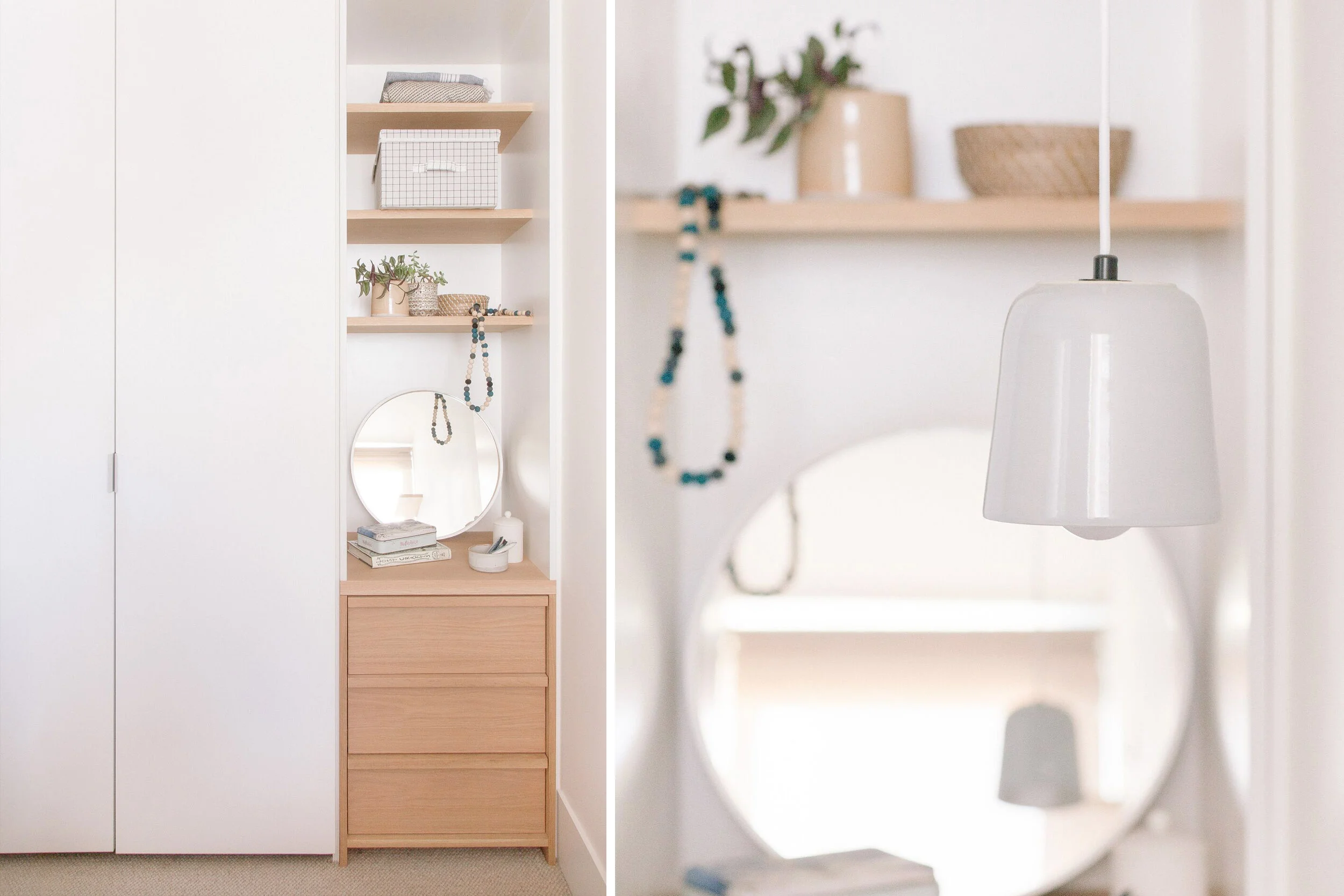
The master bedroom was too small for anything else other than a queen bed and one bedside, and the resulting feeling was a 'bed in a box' with little visual interest around the bed. We solved this by removing one of the built-in wardrobes and installing a custom drawer unit and open shelving above. This little nook articulates the small space, creating an opportunity for display and the drawers provide more useful storage than cupboards. We designed a floating bedside table that maximised floor space and added a hanging bedside lamp from Anchor Ceramics on the other side to remove the need for a second bedside. A wall mounted shelf provided a platform for vertical interest. 

brave new eco sustainable interior design megan norgate

In the second bedroom (which triples as a study, a yoga room, and a guest bedroom) we removed a double door wardrobe and built a desk into the alcove, meaning the floor space could remain clear for yoga sessions and be easy to adapt with a fold out queen bed for guests. Allergic to waste as we are - we recycled all the removed cupboards and light fittings into another project.

brave new eco sustainable interior design megan norgate


Finally we sourced a few key decorative items and furnishings and supplied a comprehensive plantscaping package, choosing low maintenance house plants appropriate to each space's light levels and optimising the number of plants to the space for air purification. The outcome is a compact apartment yet rich in texture: simple, yet warm and calming. 

I met with the owner the other day and she told me that she had not bothered to make any holiday plans for the summer as she loved being in her home so much. In her words "The greenery in my space is gorgeous and has totally improved the feeling of my place....My home is a total sanctuary.. easy to live and work in, a total delight". 


All photographs by Emma Byrnes.

BUNGALOW UPCYCLE by megan norgate

14highres_westgate-23.jpg

We first visited this 1950's cream brick bungalow on a generous 800sqm block back in 2013 for a sustainable design consultation. At the time the house had an overwhelming list of issues to be resolved, it was in disrepair, dim, dated, and freezing in winter. Most confoundedly, in the 1970's, a self-contained granny-flat had been built only 4 metres from the back of the house. This addition made both buildings feel hemmed in and blocked the home's connection to the generous garden. With a south facing backyard, the home lacked in northern sunlight. To the owner's dismay, the design professionals they had met with so far had lumped it in the 'too hard' basket advising them to demolish both buildings and subdivide the block into townhouses. Such is the fate of many period homes on large parcels of land close to the CBD! The clients loved the deco style charm of the cream brick, and despite the unfortunate configuration, wanted to make the most of the considerable resources contained in two substantial and solid brick buildings with hardwood features.

brave new eco megan norgate sustainable interior design emma byrnes

Our design concept was to turn the problem on its head and make it the solution. We proposed that rather than demolishing the granny-flat and building an extension, we keep the entire footprint of both buildings and consolidate them to create one large, unified, ecologically sustainable home. This design was resourceful both materially and financially by drastically minimising the amount of new build required instead capitalising on the scope of the existing structures. We suggested an approach based on maintaining the charming original features of the principal building and upgrading the rear buildings interiors and thermal envelope extensively so that they read like new spaces. This project required a lot of imagination and a willingness of the owners to do something unconventional. To our delight, they embraced the idea wholeheartedly.

The buildings needed a total reconfiguration, refurbishment and thermally efficient retrofit. During this process, we were able to solve many diverse problems at once. We provided access to all day winter sun to daytime living areas, by placing them in the rear building. The design created a functional layout and abundant visual and physical connection to the garden. We collaborated with building designer Logan Shield to design structural upgrades to replace a substandard lean two passage currently connecting joining the main house and minor dwelling to function as a sitting room and sun trap. A new cathedral roof to the rear building allowed for the addition of north-facing clerestory windows. 

brave new eco megan norgate sustainable interior design emma byrnes

Vintage danish metal pendants were used in the kitchen along with led strip lighting under cabinets. Locally made lights were used by Giffin Design and Anna Charlesworth. Up/ down LED wall-lights were used throughout to allow for ceiling fans.

brave new eco megan norgate sustainable interior design

Creating a visual and practical connection from the residence to the rear garden was prioritised, sliding doors were added to the east courtyard and west decking- making the most of the generous productive gardens. The existing window openings were used to avoid the need for patching of exterior brick-work and the windows upgraded to high performance timber-framed double glazed models. West and south facing windows were reduced and north facing glazing increased. Flexible use of the spaces includes the potential work from home scenarios. Maximising the thermal efficiency of the buildings and upgrading to sustainable technologies involved rainwater tanks, photovoltaic systems and solar hot water. We updated the heating to two zoned efficient space heater systems and added ceiling fans. 

brave new eco megan norgate
brave new eco megan norgate sustainable interior design

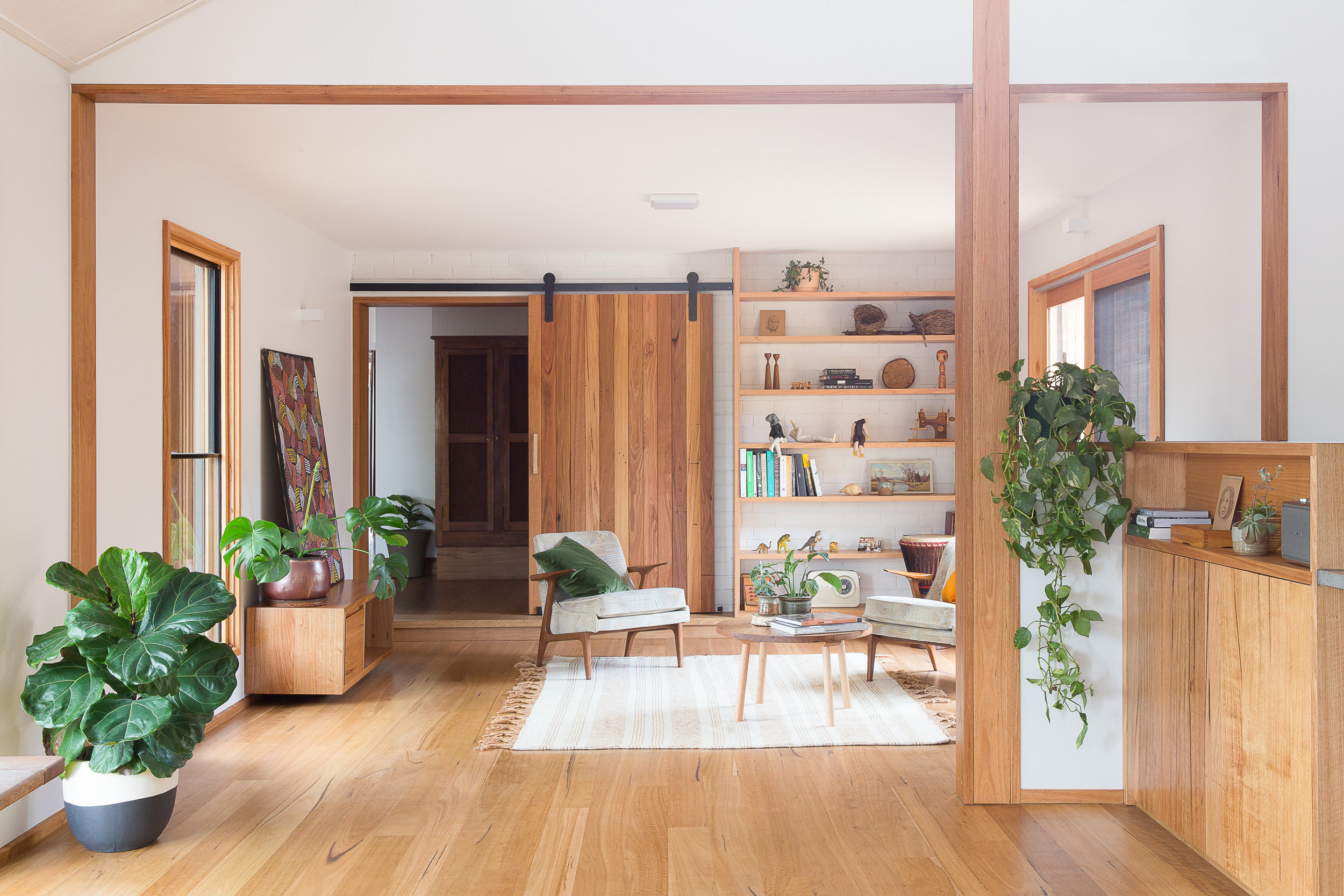
Designed in collaboration with Geometrica, an exceedingly simple timber clad structure formed the new sitting room that would slide in under the eaves and require minimal built alterations to integrate with the existing rooflines. This room opens onto outdoor living spaces to the east and west allowing the owners to follow all day sun and providing cooling ventilation. Early on we envisioned a space for reading and morning coffee and bobby coffee table and pampa rug from Pop and Scott made this space come together. 

brave new eco megan norgate sustainable interior design

The new living areas are separated from the rest of the home by a beautiful barn-style blackbutt timber door that was handmade onsite. Providing the heat zone separation, this also slides away when not in use, tucked neatly against the shelving like a feature wall panel.

brave new eco megan norgate sustainable interior design
westgate_composite09.jpg

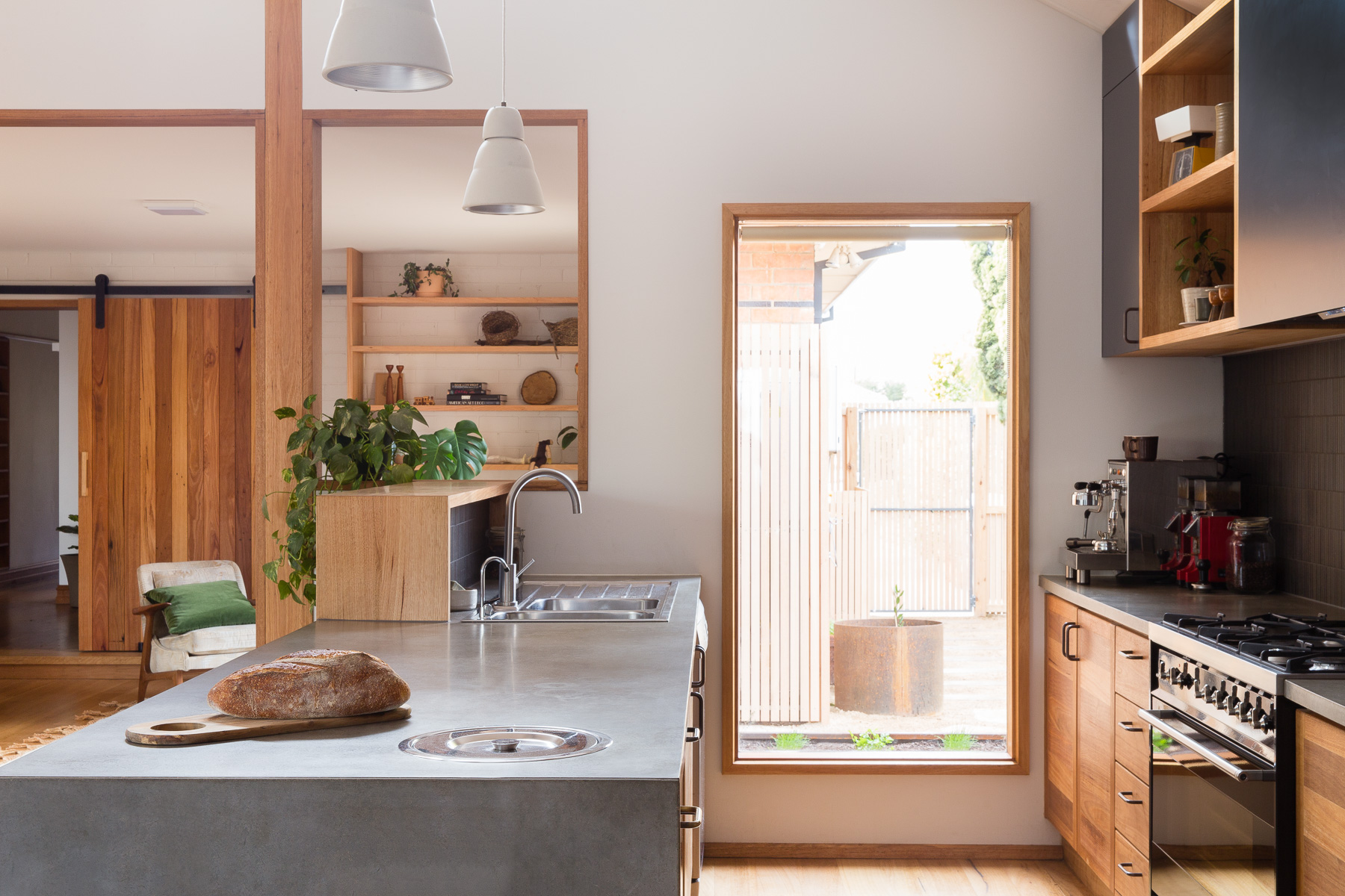
The old granny flat is now unrecognisable- entirely transformed into a warm, light, open plan, living/dining and kitchen plus a new laundry/ mud/ drying room and second bathroom. We carefully selected classically appealing details that do not reproduce the mid-century period style but instead provide a contemporary interpretation of it, building a cohesive relationship between old and new. The existing Australian hardwood detailing (Blackbutt) was continued throughout the new spaces to minimise any jarring transitions. Door and window hardware is consistent in aged brass.

brave new eco megan norgate sustainable interior design

We sourced and repurposed salvaged timber railway lockers and fluted glass doors.  A combination of vintage and locally made custom furnishings was used to create a timeless mix of style and form - unified by quality and materiality.

brave new eco megan norgate sustainable interior design emma byrnes

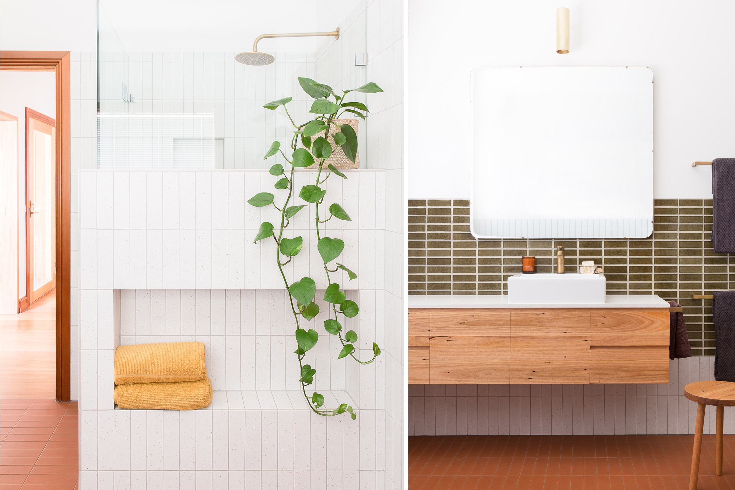
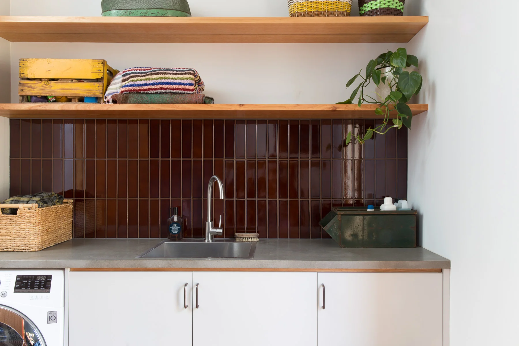
The colour palette draws on earthy deep textures and colours reminiscent of the late mid-century period 1950-1970. A neutral base of white, charcoal, warm blacks and concrete is warmed up with varying shades of warm tones come from timber, terracotta, brass and treacle-coloured tiles. Accents in deep green provide contrast. Surface materials create textural interest, with the existing exterior brick creating a new internal wall, slim plantation timber lining boards to the cathedral ceiling, mosaic tiling, raw terracotta and recycled composite surfaces. We considered durability and practical function in each space with a place for everything and robust surfaces that will age well with use.


westgate_composite04.jpg

All photographs by Emma Byrnes

PRESTON HAPPY by megan norgate

megan norgate sustainable interior design

Preston happy was completed in 2015 and was one of our few heroic-owner-builder jobs. When the clients came to us they had already gutted the back of the house and removed their kitchen. Then having the realisation it should probably not go back where it was and that they needed some help to design a new one! It's not our normal style to jump in at that stage of proceedings and churn out a design as quick as we can, as we are great believers in the value of methodical processes and slow design, however after meeting this lovely family and seeing the potential of this modest project we could not resist. This family of five were looking to make their living spaces more functional without adding any space only their originally sized bungalow, simplicity and resourcefulness were key to contain both the complexity and budget. In this case, the lean-to back of the house that often gets removed in favour of new large living areas, stayed. The kitchen we decided to tuck into where the laundry previously was, looking onto the back garden opened up to a dining and sitting.  New double glazed doors and windows in this area improved views and natural light. The kitchen footprint was tiny and complicated, with structural walls creating awkward alcoves, so we designed cabinetry that made sense of the space. Our main objective in the small 6m2 space was to make it user-friendly for a growing family. This was done by creating second workspace alcove in between the pantry and fridge where drinks and snacks could be prepared without having to get in the way of the person cooking or doing dishes. The sink was put in an oversized island bench, deep enough for kids to spread out homework or eat meals on one side while kitchen prep. Over head cupboards were taken to the ceiling provide extra storage space.  The kitchen was made in a low-cost materials, white laminate with plywood trims, and a small amount of hardwood feature shelving. Custom timber handles were made for the pantry to match, with matt textured japanese mosaic tiles for the splashback. Vintage metal pendant lights in yellow and blue were sourced on etsy and added some colour and fun to the kitchen and dining space. A softer shade of silvery blue in natural linen was used for thermally lined curtains. A hardwood built in seat was added to the end of the dining room with storage inside. The laundry was fitted into the hallway to the bathroom, again using storage to the ceiling and designed to have a curtain pull across the work-zone when not in use. The bathroom fixtures were kept in the same place to save money but it was completely transformed through new paint, tiles, toilet and tapware, and we sourced a lovely second-hand Australian hardwood hall table repurposed as a vanity. Inexpensive pool tiles were used in small quantities for the splash back. Vintage porcelain handles were sourced from etsy for the unit and a matching timber base created for a Volker haug wall light. New paint and window furnishings have created a supremely pretty and cheerful home to be in, not to big, not to fussy, just enough. 

And here is what the client had to say:
"It was great to work with Megan, who has such expertise in her field. She enabled us to simplify many of the decision-making considerations of the project. We are very happy with the final outcome. We love the freshness, the incorporation of natural materials, the colours and the beautiful details of recycled timber shelving in the kitchen (integrating it into the angled roof line and making a feature of it). The space is very functional and working really smoothly, especially the compact kitchen. Megan sourced a lovely piece of furniture for the bathroom vanity that adds such warmth to the space. The lighting is a real feature of the renovated spaces. Megan's suggestions have really enhanced the ambiance of the rooms."

megan norgate brave new eco sustainable interior design
megan norgate sustainable interior design
megan norgate brave new eco sustainable interior design

All photographs by Emma Byrnes.

LOVELY LAURA PROJECT by megan norgate

megan norgate brave new eco sustainable interior design

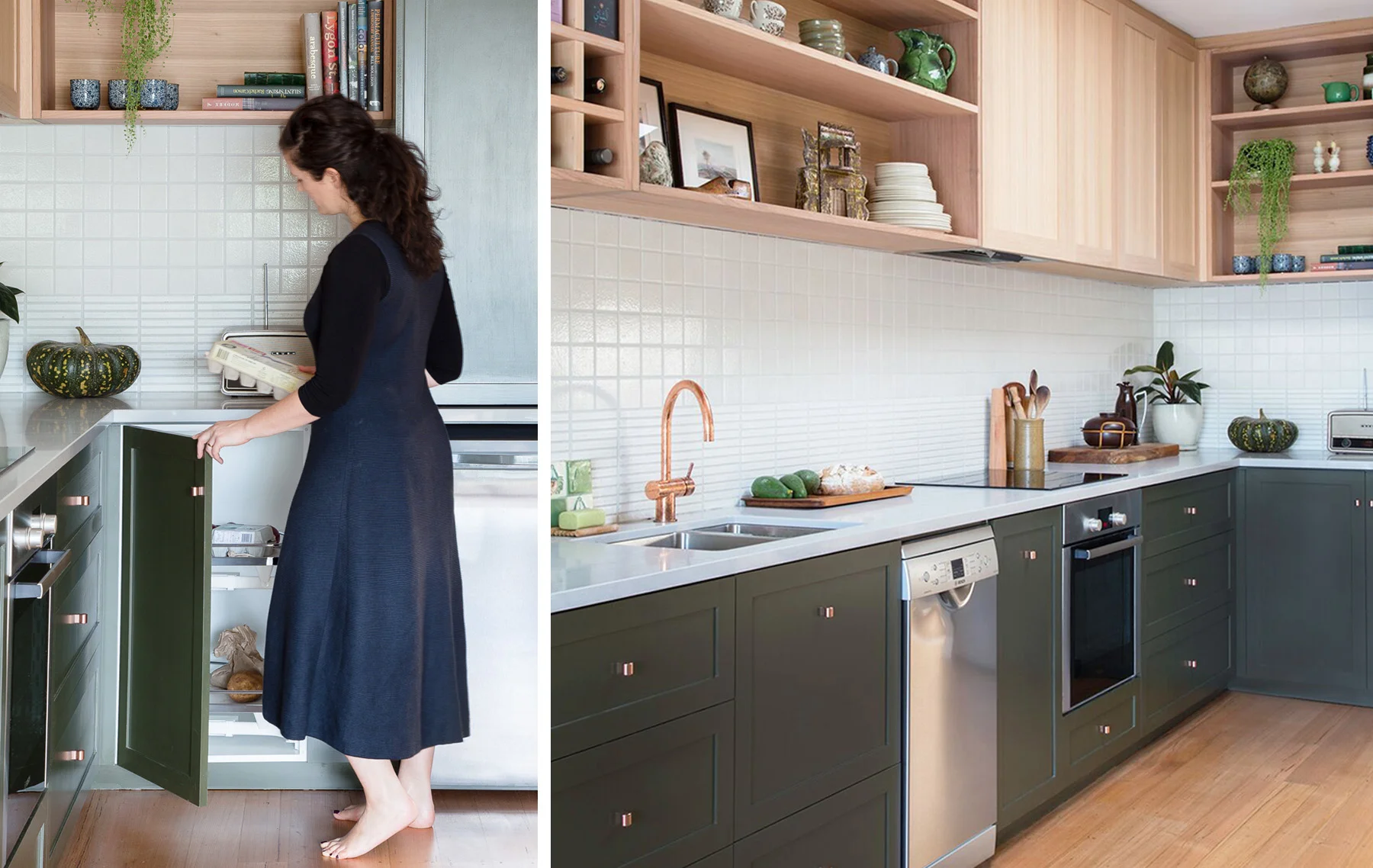
Nestled in the back streets of Brunswick is this sweet single-fronted terrace. BNE were engaged to design a new kitchen for the home- with a brief to create a super-efficient kitchen-for-one - with a small dishwasher, no gas and a only a bar fridge supplemented with a cool store corner pantry.
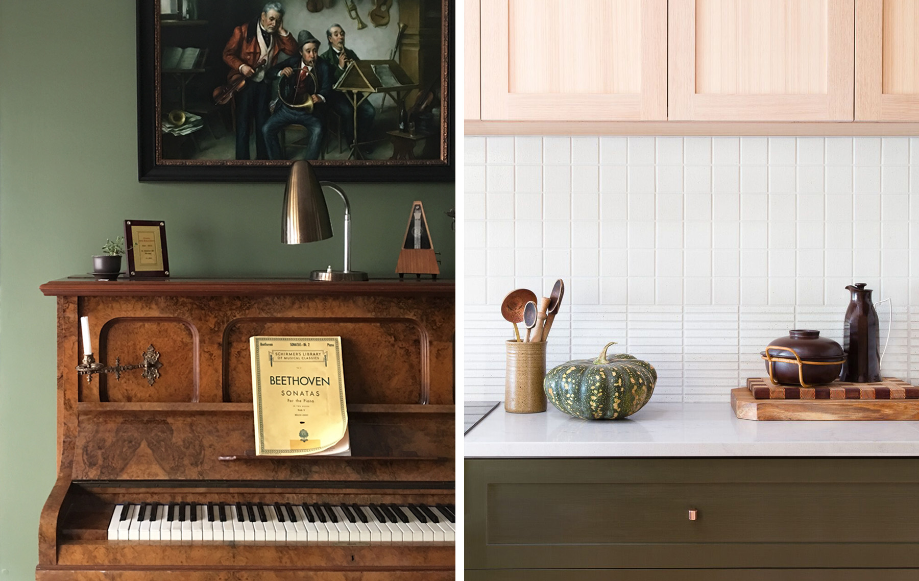
At the centre of the home is a beautiful deep green music room that flows onto the galley-style kitchen. This music room is a serene, and classically elegant space, so the kitchen was designed to reflect the same refined and timeless quality in a lighter and softer way. 

megan norgate brave new eco

Induction cooking was used to remove the house entirely from gas reliance. This allowed the meter to be removed and the owner to convert the house to 100% renewable energy via a solar system and 100% green power.  A full-size fridge was donated to charity and replaced with a small under-bench fridge. The exterior ventilated corner pantry rack houses many perishables that only need to be kept cool, not cold, such as vegetables, fruit, bread and eggs.

megan norgate brave new eco sustainable interior design

The cabinets were hand painted in water based paint - an important feature as they can be repainted instead of being replaced if the owner ever tires of green (never!). Un-lacquered copper cabinet handles and tap-ware were used for their natural microbial qualities.
Australian hardwood shelving was sealed with Osmo oils, and two formats of Japanese tiles were used to create the splashback. 

megan norgate sustainable interior design

Photographs by Emma Byrnes.
BNE FRIENDS: TRIANGLE TERRRACE by megan norgate

alice grant triangle terrace

The owner of this deliciously quirky triangle terrace lived and worked for 20 years between New Zealand, London and Australia before moving back to Australia to create a home for herself. The house would leave most people scratching their heads as to how to make it work. Wrapped around a central courtyard it is built to the boundary on three sides between another terrace, the street and a bluestone laneway angled at 45 degrees away from the street. The resulting building is full of unusually shaped spaces with two tiny triangle rooms at opposing apexes. Rooms follow on from one another, the bathroom, laundry and spare room are through the master bedroom.
Alice enlisted the skills of Nicola at Drawing Room Architecture to resolve the functionality of the spaces and design the new bathrooms and laundry, cosmetic renovation and a courtyard fit-out. She applied her project management skills as a TVC producer with gusto - managing the renovation in a harrowing timeline with a baby on the way.
The modest but transformative renovation ensured every space was carefully considered to centre around the courtyard garden and for life with a young son. The previously dark and masculine spaces were softened with new tiles and paint colours.  Last year, Megan of Brave New Eco had the pleasure of styling the home for a shoot with Australian born, UK based photographer Penny Wincer.

alice grant triangle terrace

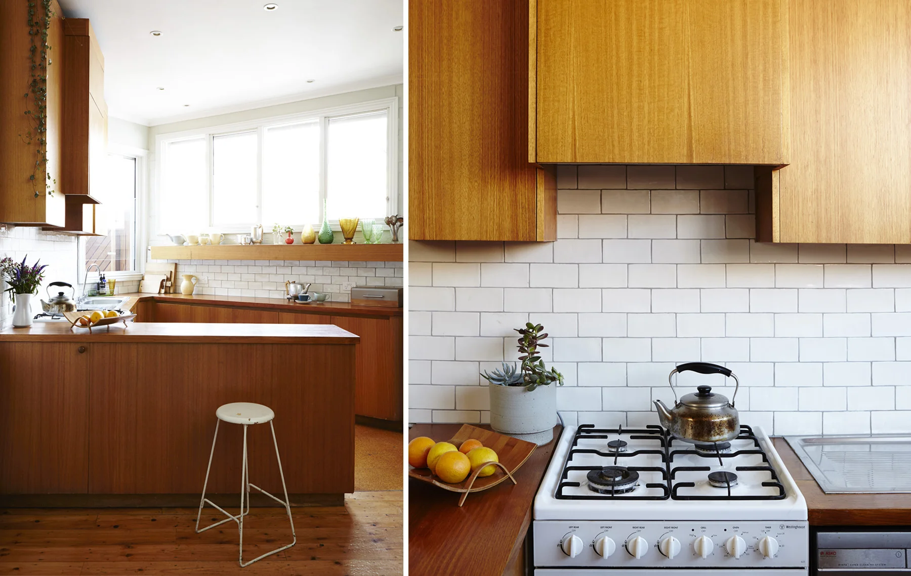
The triangle kitchen is our favourite part of this house. Surprisingly functional for such an awkward shape, the timber cabinetry is the original 1970's fit out. 
New tiles and openable windows were added for cross-flow ventilation. A collection of Alice's iconic NZ Crown Lyn pottery lines the shelf above the window and Alice's collection of teapots get a good workout in this lovely space. 

alice grant triangle terrace
Designed by Nicola from Drawing Room Architecture, The west facing outdoor courtyard features built-in seating and garden beds, a beautiful tall slatted fence and oversized gate and a shady pergola to protect from the hot summer sun. Alice fill…

Designed by Nicola from Drawing Room Architecture, The west facing outdoor courtyard features built-in seating and garden beds, a beautiful tall slatted fence and oversized gate and a shady pergola to protect from the hot summer sun. Alice filled the space with a table tiled in vintage Art Deco tiles, a huge range of plants, mirrors and shelves to vertical surfaces. 

alice grant triangle terrace
triangle terrace
alice grant triangle terrace

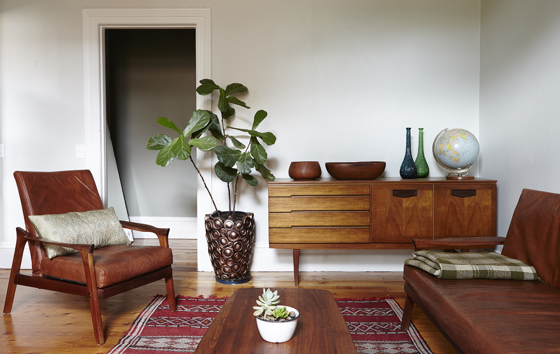
An interior palette of rinsed-out early 20th century tones chosen by Nicola was used, to soften the classic spaces and create a classic backdrop to Alice's eclectic furnishings. Vintage light fittings were installed throughout and Alice has furnished the home lovingly with her collection of vintage English and New Zealand objects and furniture. Brave New Eco made some lovely linen curtains trimmed with a vintage Japanese obi.
Alice is an intuitive and disciplined collector, and the home is filled with delightful vintage pieces from her native New Zealand, and Australia and England. She takes a considered approach and really adheres to the William Morris idea that we should only have things in our homes that we find to be useful or consider to be beautiful. The result is a unique and cohesive space, full of humble charm and interest. 

alice grant triangle terrace
A teeny-tiny bathroom/ laundry and toilet were reconfigured by Nicola, making them functional despite the spatial challenges, graphic detail in the vanity and tiles adding interest. Trims and mouldings were painted white to contrast with the timber …

A teeny-tiny bathroom/ laundry and toilet were reconfigured by Nicola, making them functional despite the spatial challenges, graphic detail in the vanity and tiles adding interest. Trims and mouldings were painted white to contrast with the timber floors and provide cohesion. 


BNE FRIENDS- KINGS CROSS RAMBLER by megan norgate

brave new eco styling

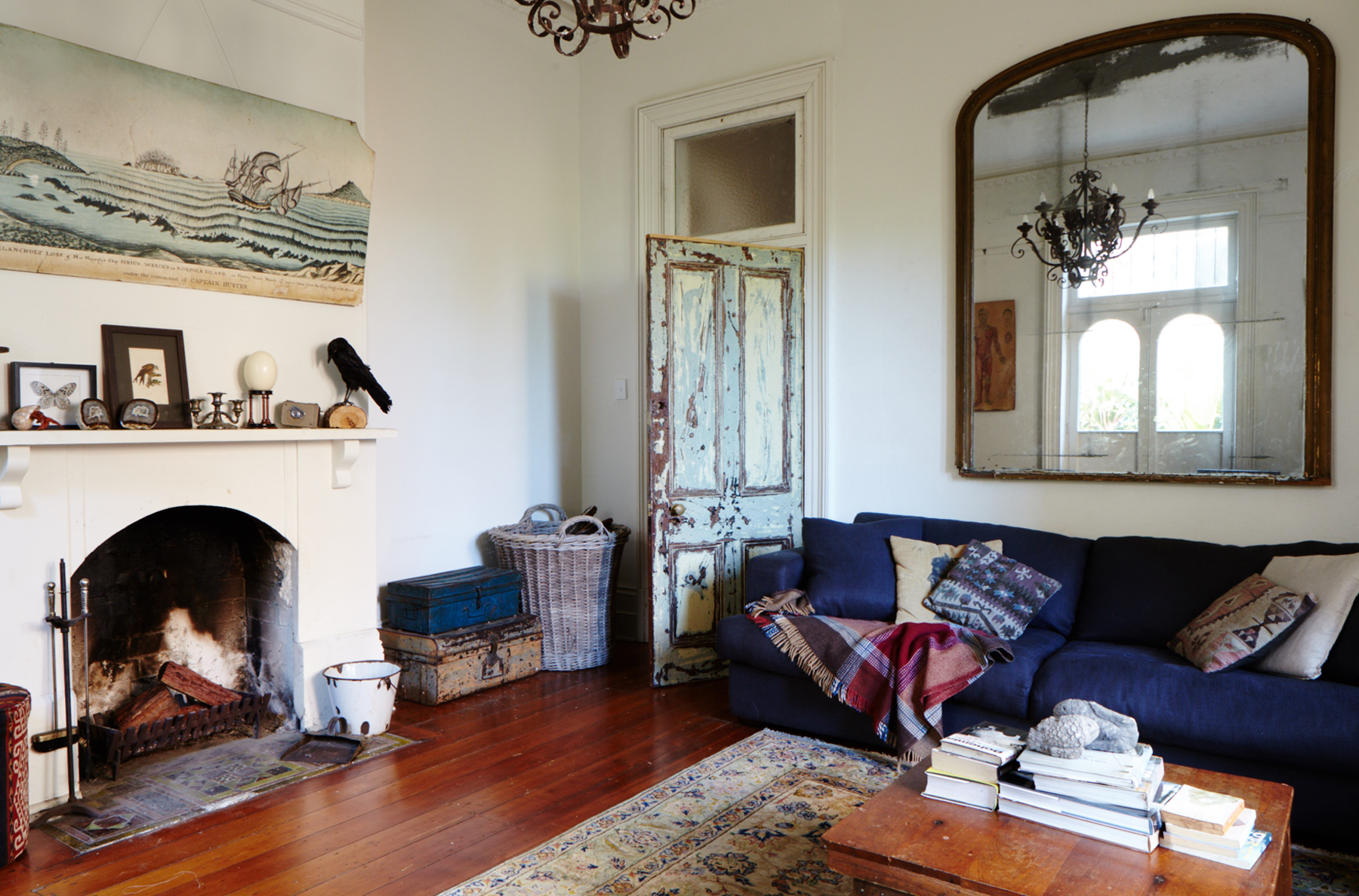
Here at Brave New Eco we have a particular affection for old houses in need of some love. There is something about the act of custodianship of an old building, especially one that is under-appreciated, that we feel compelled by. Only certain people will take on a loving rehabilitation of a lame home knowing it will become a bottomless pit for time and resources - it takes a very optimistic and imaginative personality. I thought we would share the story of one such house, originally styled and written by Megan and photographed by Penny Wincer for UK Homes and Antiques magazine. 

Five years ago, creative Sydney couple Rani Chaleyer and Rupert Glasson were considered crazy by their friends and family for buying ‘Barncleuth’ - an abandoned and derelict Victorian Italianate mansion, located on the edge of Sydney’s notoriously seedy but rapidly gentrifying Kings Cross. The building had fallen into a state of disrepair. Together, on a shoestring budget and in record time, they have restored and transformed the faded beauty to create a unique home - vibrant and robust enough for busy family life.

brave new eco styling
brave new eco
brave new eco styling

When Rani first saw the house on the internet she was intrigued as to how such a substantial property, (a set of two semi-detached three-storey Victorian houses in an inner-urban location), could have been left empty so long. The building had been a backpacker’s known as ‘The Pink House’ – reviewed as "the worst backpackers in the world” for its filth and rodent populations. Eventually shutting down, Barncleuth was left empty and inhabited with a transient population of squatters.

When she arrived to inspect the property the real estate agent initially refused to let her inside with her then 5-year-old daughter. Eventually she convinced him to let them look at just a few rooms. It took only those few rooms for Rani to see the vast potential beneath apparent dereliction. The house had 4-metre high ceilings, opposing windows in each room, filigree balconies and a glorious central staircase between three levels of dramatically proportioned spaces. This was a once-in-a-lifetime opportunity and they moved quickly to purchase the pair with another family member.

brave new eco styling

With a third child on the way, the demolition and restoration process began immediately - removing partition walls and bathroom stalls left by the backpackers. A tiny kitchen and laundry was opened up to create a large kitchen leading onto a courtyard. What was left of the modest budget was used for the simplest of renovations - polishing floorboards and painting. The transformation was immediate and dramatic, revealing the inherent proportional beauty and period details of the interiors. With new bathrooms and a simple industrial kitchen, some half-hearted patching and repairs, the home was a new modest version of its previous grandeur.

One of the immediate joys for Rani was to be able to provide a worthy setting for the family heirlooms passed down through her mother’s side of the family:
“Luckily I come from a great line of people obsessed with old things. I grew up with very strong memories of my grandparent's and mother's houses being filled with antiques and curiosities. So it was very exciting for me to be in a space that lent itself to that aesthetic. Some of the things I took to the house that I had grown up with were very special."

brave new eco styling

The home has been filled with industrial and antique furnishings bought both online and at various small stores and markets in Sydney, those more likely to carry the rustic, unrestored items Rani prefers. Rani spent many hours scouring Gumtree, where she has picked up oversized 19th and 20th century antiques from sellers without space just wanting them off their hands.

Her eclectic style is unified by an absence of polish. Everything is faded and worn, yet robust beneath patinered surfaces:
“The worst thing to me is something polished. Industrial pieces create a more utilitarian feel and a simplicity that balances some of the more ornate items. I think it comes from my childhood of growing up in eclectic spaces where everything has an imperfection or rawness and that’s the element that unites it all together."

brave new eco styling

Rani’s collections of objects reflect a strong sense of nostalgia, wonder and macabre curiosity. Collections of taxidermy insects, butterflies, shells, bones, old photo’s scientific and educational ephemera grace the cabinets and mantelpieces:
“When I was little, my father would take me to the museum to see the taxidermy exhibitions, I have always had a natural history fascination and have loved the uncanny nature of the world of curiosities, biological specimens and Victorian dioramas."

brave new eco styling

For Rani and Rupert the damaged state they found the home in was one of the qualities that appealed to them - a space that children would not need to be too careful in. The house is an ongoing project and a more substantial kitchen renovation is up next. This ever-changing landscape suits the growing family's lifestyle as a revolving door of local and international visitors use the home as a Sydney base. Large groups of children and adults are regularly entertained, having had created a home with a comfortable balance between utility and beauty.
“We love to fill our house with people, the house is not at all precious or formal, it just absorbs small children and everything in here is robust enough to withstand some boisterous activity”, says Rani.

PLEASING AND PRODUCTIVE- A PERMACULTURE GARDEN DESIGN APPROACH by Miri Ransom

brave new eco sustainable landscape design

Most of our homes have a bit of outdoor space in which to make a garden. Time spent in a garden can induce a sense of peace and calm or mindfulness. As well as creating beauty, a garden brings a connection with nature, its seasons and rhythms. The understanding of this connection, of working with nature to nurture oneself, is most clearly expressed in a permaculture garden. Miri Ransom works in collaboration with Megan in the Brave new eco team designing landscape solutions and creating detailed planting plans. In this article she outlines our particular approach to urban permaculture design; Firstly to create environments that match the landscapes and inhabitants physical and practical resources, and secondly to create productively useful and ecologically beneficial environments, that are also aesthetically beautiful. You can hear more of Miri's garden musings at her Daily Gardener blog.

WHAT IS PERMACULTURE?

Permaculture is the conscious design of productive, sustainable and resilient ecosystems in which human beings and nature coexist harmoniously. Designing a garden is an opportunity to engage with the key permaculture principles of care of the earth and care of people. A permaculture garden design begins with two questions: how could your custodianship of a garden have a beneficial environmental impact? And in what ways could a garden enhance the quality of your life?

brave new eco sustainable landscape design

OBSERVING:

The initial phase of the permaculture design process is observation. This involves conducting a site survey which takes into account the aspect and topography of the site, its soil makeup, local climate, movement of water through the site, prevailing winds and existing landscape features such as established trees, as well as the borrowed landscape beyond the fence. Drawing on careful observation, the garden design is able to harness the advantages of the site and to mitigate any disadvantages.

chooks.jpg

BEING PRAGMATIC:

While permaculture gardens are designed to be less labour intensive than conventional gardens – because we work with nature rather than against it, the design needs to take into account the human resources available to be drawn on. How much time do you want to devote to your garden? Do you have an ambition to grow some of your own food? Do you want your own orchard and chickens? Or maybe a few herbs and salad greens is more realistic with the time you have available.

brave new eco sustainable landscape design

CREATING SPACES TO INHABIT

A garden extends the living areas of the house into the outdoors, providing tranquil private spaces that are shaded and cool in summer while allowing winter sun in. The placement of trees, shrubs and climbers in the garden can enhance the passive solar capacity of a building design. Deciduous plantings are sited to the north, east and western sides of house while evergreens are situated on the south side of buildings.

composite02.jpg

DESIGNING THE STRUCTURE:

The hard landscaping component of the design should sit lightly on the earth both visually and in terms of its environmental impact. A permaculture design requires a careful consideration of the potential toxicity, embodied energy and durability of any materials used in the construction of the garden. Our preference is for gardens with minimal hard landscaping, using natural and recycled materials, where the planting design is the dominant feature of the landscape.

brave new eco sustainable landscape design

ENSURING A WATER SUPPLY:

It is important that the landscape design employs strategies to capture and use water effectively. Water tanks and efficient drip-line irrigation systems divert catchment rainwater away from stormwater drains and cycle it back into the garden. 

brave new eco sustainable landscape design

BUILDING UP SOIL:

Another key consideration in a permaculture garden design is the building of nutrients and organic matter in soil. The soil’s water holding capacity is improved by increasing its humus content (the dark organic matter in the soil formed from the decay of plant material), which also enables carbon to be sequestered in the soil. Because digging in the garden releases carbon from the soil, we aim for minimal soil disturbance, instead using deep forking to gently loosen the soil and spreading manures and composts over the soil surface. Mulching is crucial to minimise evaporation and protect the beneficial soil microbes.  

brave new eco sustainable landscape design

NUTRIENT CYCLES

A permaculture garden design also needs to facilitate nutrient cycling. Rather than exporting garden waste products off site through green waste and rubbish collection, we use worm farms, composting systems and chickens to convert the waste into food for the garden. Ultimately the garden becomes a ‘closed’ system, feeding itself without the need for toxic and expensive external inputs such as fertilisers purchased at the garden centre.

brave new eco sustainable landscape design

GIFTS FROM THE GARDEN:

In a permaculture garden design, much of the available growing space is reserved for productive or edible plants. In a relatively small amount of time a productive permaculture garden yields enough home grown fruit, herbs and vegetables to share with friends and neighbours. Productive plantings will be a mixture of perennial plants such as fruiting trees, and annual cropping vegetables. The planting design includes companion or guild planting to attract beneficial insects to the garden and deter pests, minimise weed invasion and contribute nutrients to the soil.

brave new eco sustainable landscape design

A THING OF BEAUTY:

A well-designed garden is beautiful as well as sustainable. Non-productive areas of the garden are designed as habitat rich perennial and self-seeding annual plantings. This naturalistic planting design is beautiful as well as wildlife friendly, providing cover, water and food for birds, reptiles and insects. Consideration is given in the design to the ecological compatibility of plant species as communities, as well as their site suitability in terms of climate, rainfall, light levels and soil type. For a design to work, the right plant needs to be put in the right place.

brave new eco sustainable landscape design

ENSURING TOLERANCE:

In many cases a naturalistic planting design will make use of native and indigenous plants. However there is a huge range of climate appropriate exotic plants that can provide habitat and food for wildlife. When exotic perennial plants are integrated with native plants we are able to extend both the season of interest in a garden and its aesthetic possibilities. Plants are selected for their form, texture or colour, or sometimes the way they catch the light, and are combined to create beautiful and atmospheric planting schemes.

brave new eco sustainable interior design